This topic contains the following sections:
The Ignite UI for jQuery™ grid, or igGrid, Paging feature allows you to divide your data in pages so that you can achieve better performance by fetching only a predefined number of records from your original data source.
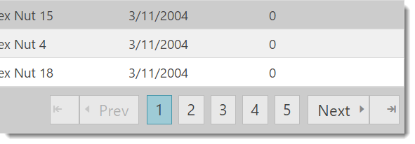
Figure 1: Typical grid paging UI

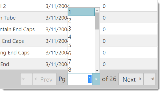
Figure 2: Paging with a dropdown selector

Note: The grid’s Paging feature is implemented as a jQuery UI widget, and therefore follows the standard lifecycle typical of a jQuery UI widget.
Paging may be setup for local or remote execution. In the first case, the paging operations are performed on the client. This means that all your data is present in the browser, but only the number of records as specified by the pageSize property is rendered to the user.
In the case of the “remote” scenario, for every page change, the grid initiates a request to the dataSource specified in the grid, by automatically calculating and appending all necessary parameters to the request, such as pageIndex and pageSize.
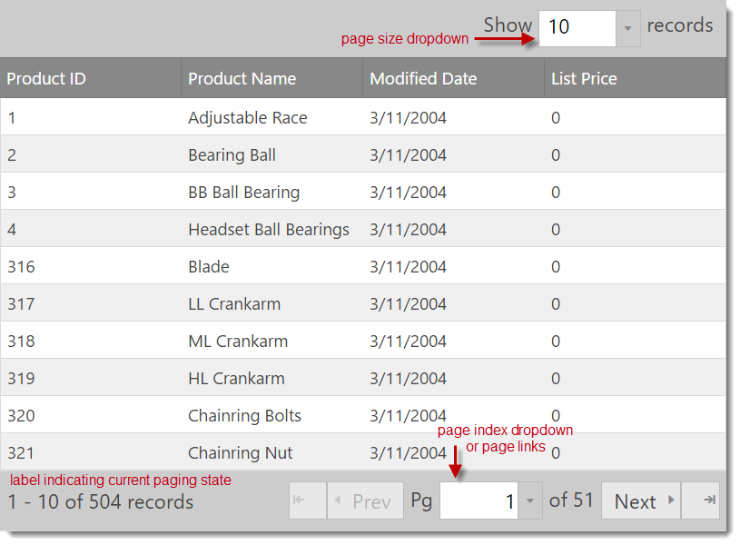
The Paging feature allows the user to change the pageSize through the UI, which is available either in the grid header (above the grid column headers), or as part of the pager area.
Note: All parts of the paging UI can be navigated with keyboard using TAB and Shift-TAB.
The Paging feature supports binding to oData services out-of-the-box. When binding to oData, the required parameters are automatically determined and set in the service request. You only need to point the dataSource option of the grid to your service URL.
When using Paging from the Ignite UI for MVC, Grid all paging-related data binding logic is performed automatically by translating the paging URL parameters to LINQ expressions.
Depending on the value of the pageCountLimit property, the UI automatically switches from page links to rendering a page index dropdown.
Note: The dropdown & editors used in the grid’s Paging feature are instances of the
igEditorcontrol.
In order to enable Paging, you first need to include the necessary JavaScript and CSS dependencies. The easiest way to include the necessary dependencies is to use the combined/minified version of the scripts and styles as shown in Listing 1.
Listing 1: Required script and CSS files for grid paging
In HTML:
  <link type="text/css" href="infragistics.theme.css" rel="stylesheet" />
  <link type="text/css" href="infragistics.css" rel="stylesheet" />
  <script type="text/javascript" src="jquery.min.js"></script>
  <script type="text/javascript" src="jquery-ui.min.js"></script>
  <script type="text/javascript" src="infragistics.core.js"></script><script type="text/javascript" src="infragistics.lob.js"></script>
If you would like to include only the minimal Ignite UI for jQuery™ scripts necessary for paging, you can do so by referencing the scripts as depicted in Listing 2.
Listing 2: Minimum scripts and styles to enable grid paging
In HTML:
  <script type="text/javascript" src="infragistics.util.js"></script>
  <script type="text/javascript" src="infragistics.util.jquery.js"></script>
  <script type="text/javascript" src="infragistics.dataSource.js"></script>
  <script type="text/javascript" src="infragistics.ui.shared.js"></script>
  <script type="text/javascript" src="infragistics.ui.popover.js"></script>
  <script type="text/javascript" src="infragistics.ui.editors.js"></script>
  <script type="text/javascript" src="infragistics.ui.grid.framework.js"></script>
  <script type="text/javascript" src="infragistics.ui.grid.paging.js"></script>
Listing 3: Initializing the igGrid control with paging enabled
In Javascript:
  $("#grid1").igGrid({
      columns: [
          { headerText: "Product ID", key: "ProductID", dataType: "number" },
          { headerText: "Product Name", key: "Name", dataType: "string" },
          { headerText: "ProductNumber", key: "ProductNumber", dataType: "string" }
      ],
      dataSource: adventureWorks,
      responseDataKey: 'Records',
      features: [
          {
              name : 'Paging',
              type: "local",
              pageSize : 7
          }
      ]
  });
Listing 4: HTML container used to instantiate the grid
In HTML:
<table id="grid1"></table>
Listing 5: Example JSON data
Response:
  var adventureWorks = { "Records" : [
        { "Name" : "Adjustable Race",
          "ProductID" : 1,
          "ProductNumber" : "AR-5381"
        },
        { "Name" : "Bearing Ball",
          "ProductID" : 2,
          "ProductNumber" : "BA-8327"
        }
        /*the full JSON output is omitted*/
      ]
  }
Listing 6 demonstrates how to initialize the Ignite UI for MVC Grid with paging enabled in an ASP.NET MVC view and controller.
Listing 6: Initializing the grid with paging enabled in ASP.NET MVC
In ASPX:
  <%= Html.Infragistics().Grid(Model).ID("grid1").Columns(column =>
     {
        column.For(x => x.ProductID).HeaderText("Product ID").Width("100px");
        column.For(x => x.Name).HeaderText("Product Name").Width("200px");
        column.For(x => x.ProductNumber).HeaderText("Product Number").Width("200px");
     }).
     Features(features =>
     {
        features.Paging().PageSize(20);
     }).
     Height("500").
     DataSourceUrl(Url.Action("PagingGetData")).
     DataBind().
     Render() %>
In C#:
  public class HomeController : Controller
  {
      public ActionResult Index()
      {
          return View();
      }
      [GridDataSourceAction]
      public ActionResult PagingGetData()
      {
          return View(this.GetCustomers().AsQueryable());
      }
      private List<Product> GetProducts()
      {
          List<Product> products = new List<Product>()
          {
              new Product() { ProductID = 1, Name = "Adjustable Race", ProductNumber = "AR-5381" },
              new Product() { ProductID = 1, Name = "Bearing Ball", ProductNumber = "BA-8327" }
          };
          return products;
      }
  }
When you're using Ignite UI for MVC it will handle remote paging automatically for you. You are required to create action method decorated with GridDataSourceActionAttribute attribute which returns ActionResult (Listing 6). In the action method just pass the data as instance of IQueryable. The GridDataSourceActionAttribute class (which implements IActionFilter interface) will transform the data according the request parameters and will return it as JsonResult.
If you are implementing your own remote service (for example in ASP.NET or PHP), in order to properly initialize and render the pager, your service must specify both the responseDataKey (grid option) and the recordCountKey (paging option). The recordCountKey member tells the Paging widget how many records in total are in the backend. The responseDataKey specifies which property in the response contains the resulting data.
Therefore, when remote paging is used, the grid automatically generates the proper request parameters in the following way:
http://<server>/grid/PagingGetData?page=2&pageSize=25
Note: You may change the key names, by setting the
pageSizeUrlKey/pageIndexUrlKeyin the Paging options, respectively.
You can change the page index or the page size programmatically, in the following ways:
Listing 7: Retrieve the page size
In Javascript:
$(“#grid1”).igGridPaging("option", "pageSize");
Listing 8: Retrieve the current page index
In Javascript:
$(“#grid1”).igGridPaging("option", "currentPageIndex");
Listing 9: Change the current page index so that the third page is loaded
In Javascript:
$(“#grid1”).igGridPaging(“pageIndex”, 2);
You can easily achieve a “Quick Pages” effect in your grid, by changing the visiblePageCount option. This means that the grid only renders as many page links as defined by visiblePageCount. Therefore, if visiblePageCount is 5, and you are on page 3, page links “1” and “2” are rendered to the left, and page links “4” and “5” to the right.
Note: The Paging widget still renders a dropdown to choose the current page, if the actual page count exceeds the value of the
pageCountLimitoption.
You can also customize the page size list by setting the pageSizeList (array) option in the paging options. Each value in the array specifies the size of the page, added in order of page index. For instance:
pageSizeList: [10, 44, 123, 5]
The array above specifies a size for page 1 equal to 10 rows, 44 for page 2 and so on.
You can bind to client-side events either during initialization or after the widget is instantiated. The first approach allows you to existing instances of the grid:
Listing 10: Associating event handlers to page indexed changed event on the client
In Javascript:
$("#grid1").bind("iggridpagingpageindexchanged", handler);
Note: Use “live” instead of “bind” if paging is not yet instantiated.
The second approach allows you to define event handlers during initialization by specifying the event name as an option when you initialize the paging feature.
Note: This binding syntax is case sensitive as opposed to attaching with the bind or live jQuery functions.
Listing 11: Associating event handler to page index changing during initialization
In Javascript:
  {
      Name: “Paging”,
      pageIndexChanging: handler,
      < other paging options>
  }
Then your “handler” function would resemble the code in Listing 12.
Listing 12: Blank event handler called by paging feature
In Javascript:
  function handler(event, args) {

  }
Note: The
argsis explained in detail below, for every event, respectively.
Table 1: List of Client-side Events
| Event Name | Description | Event Args Definition |
|---|---|---|
| pageIndexChanging | Fired before the page index is changed and the data is data bound, can be cancellable. To cancel it just return false in the handler | newPageIndex: Index of new page currentPageIndex: Index of current page owner: Reference to the igGridPaging object |
| pageIndexChanged | Fired after the page index is changed. | pageIndex: Index of new page index owner: Reference to igGridPaging object |
| pageSizeChanging | Fired when the page size is changed from the DropDown on the UI. Not fired when the page size is changed manually using the API. | currentPageSize: Current page size newPageSize: New page size owner: Reference to the igGridPaging object |
| pageSizeChanged | Fired after the page size is changed. | pageSize: New page size owner: Reference igGridPaging object |
| pagerRendering | Fired before the pager starts rendering its elements. Can be cancelled and overridden, for more custom paging scenarios. | dataSource: Reference to the data source object owner: Reference to the igGridPaging object |
| pagerRendered | Fired after the pager renders its elements. | Same as the pagerRendering event |
Figure 1: Location of paging UI elements

Table 2 details the list of initialization options and descriptions available for the Paging feature.
Note: The value in parenthesis denotes the default option value.
Table 2: Available grid Paging initialization options
| Paging Option | Description |
|---|---|
| currentPageIndex (0) | The current page index. Can be set manually or invoked through the API by calling pageIndex(index). |
| pageSize (25) | The number of records to display on one page. Default is 25. |
| recordCountKey (null) | The property in the response which points to the total number of records. So if the response is a JSON object, this is the object property holding the total number of records on the backend. |
| pageSizeUrlKey (null) | The URL param name in which the page size is encoded. (ex: ?psize=20) |
| pageIndexUrlKey (null) | Same as the above, but for index. If values are left empty (null), oData syntax is assumed.The value is delegated to the igDataSource™ control after setting it for the grid. |
| type (“remote”) | The type of paging – local or remote. There can still be a Service URL as the data source, and have local paging at the same time. |
| showPageSizeDropDown (true) | Defines whether the dropdown allowing the user to change the page size is rendered or not. |
| pageSizeDropDownLabel (“Show “) | The label text that is rendered before the page size dropdown label. |
| pageSizeDropDownTrailingLabel (“records”) | The trailing label text that is rendered after the page size dropdown is rendered. |
| pageSizeDropDownLocation (“above”) | The value of this option is either “above” or “inpager”. The “inpager” option renders the page size dropdown as the last part of the pager UI located inside the footer area of the grid. The “above” option renders the drop down above the grid header. Depending on styling the drop down can be displayed to the left, right or in the middle. Default is right. |
| showPagerRecordsLabel (true) | This is the label that specifies which records are shown from the total of XXX records. Typical values are usually something like: “100 - 125 of 239 records”. |
| pagerRecordsLabelTemplate ("$startRecord$ - $endRecord$ of $recordCount$ records") | Template for the pager records label that is available for customization. |
| nextPageLabelText (“next”) | The label text rendered before the next page image / icon. |
| prevPageLabelText (“prev”) | The label text rendered after the prev page image / icon. |
| firstPageLabelText | Same as above |
| lastPageLabelText | Same as above |
| showFirstLastPages (true) | Defines whether to render the previous page image / button or not. |
| showPrevNextPages (true) | Same for the next page. |
| currentPageDropDownLeadingLabel (“Pg”) | The leading label text in the span element in front of the dropdown used to choose a specific page index. |
| currentPageDropDownTrailingLabel ("of $count$") | Same as the above but for the trailing label span. |
| currentPageDropDownTooltip | Custom localized tooltip for the page index dropdown. |
| pageSizeDropDownTooltip | Custom localized tooltip for the page size dropdown. |
| pagerRecordsLabelTooltip | Custom localized tooltip for the pager records label. |
| pageSizeList [5, 10, 20, 25, 50, 75, 100] | A list of options for the page size dropdown. |
| pageCountLimit (10) | After this value is exceeded (default is 10), rendering switches from page links/numbers to dropdown to facilitate paging. |
| visiblePageCount (5) | Visible number of page links rendered. The active/current one is always in the middle and has an equal number rendered to the left or to the right (if the number is odd). Others can be reached by using PREV and NEXT buttons. |
| defaultDropDownWidth (70) | Default width of page index and page size dropdowns. |
| firstPageLabelText (“”) | The text to display for the first page label. |
| lastPageLabelText (“”) | The text to display for the last page label. |
| showFirstLastPages (true) | Specifies if the first and the last pages buttons are rendered. |
| pageSizeDropDownTooltip (Choose number of records per page) | Specifies a custom localized tooltip for the page size dropdown. |
| pagerRecordsLabelTooltip (Current records range) | Specifies a custom localized tooltip for the pager records label. |
| prevPageTooltip (go to the previous page) | Tooltip for the previous page button. |
| nextPageTooltip (go to the next page) | Tooltip for the next page button. |
| firstPageTooltip (go to the first page) | Tooltip for the first page button. |
| lastPageTooltip (go to the last page) | Tooltip for the last page button. |
| pageTooltipFormat (page $index$) | Custom localized tooltip for a page link/button. |
As you work with the grid Paging feature, you may want to customize the look of the pager for any given UI element. Table 3 details the available classes applied to the grid pager UI.
Table 3: Available classes for the Paging widget
| UI Area | Overview of the rendered UI area | List of CSS classes applied to this area |
|---|---|---|
| pagerClass | The whole pager, this is a div rendered after the grid table or scrolling div. | ui-widget ui-iggrid-pager ui-helper-clearfix |
| pageLink | Classes applied to the <a> tag inside every <li> for every page number. |
ui-iggrid-pagelink ui-helper-reset |
| page | Classes applied to every <li> in the <UL> that holds page numbers. |
ui-iggrid-page ui-state-default ui-corner-all |
| pageHover | Class applied to a page list item when it’s hovered. | ui-iggrid-page-hover ui-state-hover |
| pageList | Classes applied to the <UL> which holds the list of page numbers (links). |
ui-helper-reset ui-iggrid-pagelist |
| pageLinkCurrent | Classes applied to the current page index’s Li’s <a> tag. |
ui-iggrid-pagelinkcurrent |
| pageCurrent | Classes applied to the <li> tag corresponding to the current page index. |
ui-iggrid-pagecurrent ui-state-active ui-corner-all |
| pageFocused | Classes applied to the current page that has focus (when keyboard anvigation is used). | ui-iggrid-pagefocused ui-state-focus |
| prevPage | Classes applied to the DIV holding the prev icon image and the prev label. | ui-iggrid-prevpage |
| nextPage | Classes applied to the DIV holding the next icon image and the next label. | ui-iggrid-nextpage |
| nextPageLabel | Applied to the SPAN label for the next page text. | ui-iggrid-nextpagelabel |
| prevPageLabel | Applied to the SPAN label for the prev page text. | ui-iggrid-prevpagelabel |
| nextPageLabelDisabled | Applied to the SPAN label for prev page text, when it is disabled (i.e. when we are at page index 0). | ui-iggrid-nextpagelabeldisabled |
| prevPageLabelDisabled | Same but for the prev label disabled. | ui-iggrid-prevpagelabeldisabled |
| nextPageImage | Applied to the span which will show the next page image (as background image). | ui-iggrid-nextpageimg ui-icon ui-icon-triangle-1-e |
| prevPageImage | Same for previous image. | ui-iggrid-prevpageimg ui-icon ui-icon-triangle-1-w |
| nextPageImageDisabled | Same, when the image is disabled (there are no next records). | ui-iggrid-nextpageimgdisabled ui-icon-disabled ui-icon-triangle-1-e |
| prevPageImageDisabled | Same, but when the image is disabled (the current index is 0). | ui-iggrid-prevpageimgdisabled ui-icon-disabled ui-icon-triangle-1-w |
| pagerRecordsLabel | Applied to the span holding the label showing from/to records out of total number of records – usually rendered in the left area of the pager footer. | ui-iggrid-pagerrecordslabel |
| pageSizeLabel | Applied to the span rendered in front of the page size dropdown. (above the grid in the screenshots above). | ui-iggrid-pagesizelabel |
| pageSizeDropDown | Applied to the span holding the igEditor dropdown control. | ui-iggrid-pagesizedropdown |
| pageSizeDropDownContainer | Applied to the three spans holding the front label, the dropdown, and the trailing label of the page size dropdown. This set of classes is applied when the page size dropdown is rendered inside of the pager footer, to the right. | ui-helper-clearfix ui-iggrid-pagesizedropdowncontainer |
| pageSizeDropDownContainerAbove | Same as above, but applied when the page size dropdown is rendered above the grid. | ui-widget ui-helper-clearfix ui-iggrid-pagesizedropdowncontainerabove |
| pageDropDownContainer | The dropdown container for spans for labels/editor for the dropdown from which an end user may select the current page index. | ui-iggrid-pagedropdowncontainer |
| pageDropDownLabels | Applied to the leading and trailing SPANs holding the labels before and after the dropdown where one selects a page index: “Pg <index> Out of XXX”. | ui-iggrid-pagedropdownlabels |
| pageDropDown | Applied to the SPAN in which the igEditor dropdown is instantiated. | ui-iggrid-pagedropdown |
The following keyboard interactions are available.
When focus is on the grid:
When focus is on one of the pager buttons:
View on GitHub