This topic provides conceptual information for the igScheduler™ control including information regarding: features, configuration, requirements and theming.
This topic contains the following sections:
The table below lists the required background you need for fully understanding the information in this topic.
Topics
You need to first read the following topics:
External Resources
You need to first read the following article: Working with jQuery Widgets
The igScheduler control is a jQuery UI Widget and therefore is dependent upon the jQuery core and jQuery UI JavaScript libraries. In addition, there are several Ignite UI for jQuery™ JavaScript resources that the igScheduler control uses for shared functionality and data binding. These JavaScript references are required whether the igScheduler control is used in a pure JavaScript context.
The table below lists the requirements for the igScheduler control.
| Requirement | Description |
|---|---|
| jQuery and jQuery UI JavaScript resources | Ignite UI for jQuery is built on top of these frameworks: |
| Shared Ignite UI for jQuery JavaScript resources | There are several shared JavaScript resources in Ignite UI for jQuery that most widgets use:
|
| igDataSource JavaScript Resources | The igScheduler uses the igDataSource for data operations:
|
| igScheduler JavaScript resources | The JavaScript file for the igScheduler widget:
|
| IG Theme | This theme contains custom visual styles created especially for Ignite UI for jQuery |
| Base Theme | The base theme contains styles that primarily define the form and function for each widget. |
The table below briefly explains the main features of the igScheduler.
| Feature | Description |
|---|---|
| Views | Тhe igScheduler can be configured to use agenda, month, week or day view, together and separately. |
| Activities | The activities are used to represent an event which start at a specific time and ends at a specific time |
The igScheduler control can be configured to present calendar information in different ways called "views". The view type can be configured using views and viewMode options.
$("#scheduler").igScheduler({
    height: "100%",
    width: "100%",
    views: ["month", "agenda", "week", "day"],
    viewMode: "monthView"
});
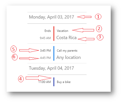
The agenda view of the igScheduler is visualizing the activities which occur during a specific time range. Activities are presented in the agenda view with their subject, location and times. If an activity has a resource associated with it and the resource has a color scheme set, this color will be used for drawing the vertical separator between the activity’s time and activity’s subject.
The following image shows the agenda view along with its visual elements:

Day Header
Activity subject
Activity location
Separator drawn using the associated resource’s color
Activity start time (available if the activity is starting during the particular day)
Activity end time (available if the activity is ending during the particular day)
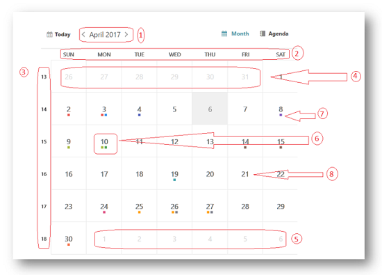
The month view of the igScheduler is visualizing the days of an entire month. Each day is represented by a cell which may contain up to three activities. The month view also has the concept of the "selected day" which is displayed using different styling (foreground color, background color, font size or font style).
The following screenshot shows the month view along with its visual elements:

Month header (containing current month and year)
Day of week header
Week number
Leading days (from previous month)
Trailing days (from next month)
Current day (displayed with different style)
Activity indicators. There indicators are rendered on days occupied with activities. Up to three activities indicators are rendered. The indicators are using the color set on the associated resource.
Current month days
The following screenshot shows the month view combined with agenda view with its visual elements:
Activity’s subject
Activity’s location
The resource’s color associated with this activity
The time associated with this activity
The Week View of the igScheduler is visualizing all seven week days based on the currently selected day. This view contains time-slot segments with same length and different height based on the time range of the appointment.
The following screenshot shows the Week View along with its visual elements:
Navigation Header
Time slots
Day headers
Activities in the time slots
The following properties could be used in order to configure different week view aspects and behaviors:
weekViewDisplayMode - Display mode. The week view can be configured to show all 7 week days or only the days configured as working days.
timeSlotInterval - Time slot duration. Configure the time slots' duration. Currently 5, 6, 10, 15, 30 and 60 minutes are supported.
workingHoursDisplayMode - Working days and hours. You can configure this view to display only working hours or all 24 hours.
Shows hour-based view of the selected day, the hours are listed vertically going from top to bottom. This view contains time-slot segments with same length and different height based on the time range of the appointment.
The following screenshot shows the Day View along with its visual elements:
Navigation Header
Time slots
Day headers
Activities in the time slots
The following properties could be used in order to configure different day view aspects and behaviors:
dayViewDisplayMode - Visible days. You can control how many days are visible at a time in the day view. Currently between 1 and 7 days are supported.
timeSlotInterval - Time slot duration. Configure the time slots' duration. Currently 5, 6, 10, 15, 30 and 60 minutes are supported.
workingHoursDisplayMode - Working days and hours. You can configure this view to display only working hours or all 24 hours.
This section provide information about the activities concept of the igScheduler control.
The activities are used to represent an event which start at a specific time and ends at a specific time.
Activities occur during a range of time with a duration of several hours, several days or even more.
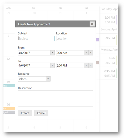
The following table lists the Appointment's key properties and their purpose:
| Field | Purpose |
|---|---|
| Subject | Used as short description of the activity, it is the main information shown in the control’s views and therefore used to distinguish a specific activity amongst the other activities. |
| Location | Used to store the location where the activity takes place. |
| From | Contains the start date and time of the activity. |
| To | Contains the end date and time of the activity. |
| Resource | Used to obtain the resource associated with the current activity. Color scheme is used to highlight the activities associated with this resource. |
| Description | Provide more information about the appointment. |

The dataSource and resources options of the igScheduler are required for the data binding. Each option need to be assigned an array that is holding the corresponding appointments or resources collection.
Please refer to the Configure appointments and Configure resources topics for a more detailed overview.
Following are some other topics you may find useful.
View on GitHub