This topic demonstrates, with code examples, how to configure the jQuery igGrid™ tooltips for the most common usage scenarios.
This topic contains the following sections:
The table below lists the most common use cases of jQuery igGrid tooltips together with the properties that configure them. Each of these use cases is explained in greater detail in the text blocks following the table.
| Use case | Configuration details | Configuration property |
|---|---|---|
| Displaying the tooltips with their default settings | To display tooltips with their default settings, just call the Tooltips feature. | name |
| Configuring cell columns without tooltips | Disabling the tooltips for a column is useful when, for example, the cells in column contain images. In this case, you configure the tooltip behavior individually per each column. | visibility columnSettings |
| Configuring a custom tooltip position | Specifying the position at which the tooltip to appear. You configure this by specifying offset of the tooltip from the mouse pointer. | cursorLeftOffset cursorTopOffset |
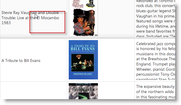
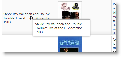
By default, tooltips display only if the text in a cell is too long to fit in it and appears truncated. The two pictures below demonstrate this behavior:


The following table lists the default property settings of the jQuery Tooltip widget.
| Property | Setting |
|---|---|
| visibility | “overflow” |
| showDelay | 500 |
| hideDelay | 300 |
| fadeTimespan | 150 |
| cursorLeftOffset | 10 |
| cursorTopOffset | 15 |
| style | "tooltip" |
To enable the tooltips with their default settings, just set the name property to “Tooltips”.
The following code enables the default behavior of the igGrid Tooltips.
In Javascript:
$("#grid1").igGrid({
    features: [
        {
            name: "Tooltips"
        }
    ]
});
Note: For information on how to do the same with MVC, see the Adding Tooltips to an
igGridtopic.
In this example, the tooltips are configured to display over every column that contains text and not over the columns that store images.
The two pictures below demonstrate this behavior:
To configure this behavior, you need to define the properties individually for every column.
The table below demonstrates the required property settings for hiding the tooltips for one column while always displaying the tooltips for the rest. For details about the properties, refer to the API documentation.
| Property | Setting |
|---|---|
| name | “Tooltips” |
| visibility | “always” |
| columnSettings | [{ columnKey: "col1", allowTooltips: true }, { columnKey: "col2", allowTooltips: false }, { columnKey: "col3", allowTooltips: true }] |
The following code disables the tooltips for the second column.
In Javascript:
$("#grid1").igGrid({
    features: [
        {
            name: "Tooltips",
            columnSettings: [
                { columnKey: "Name", allowTooltips: true },
                { columnKey: "BoxArt", allowTooltips: false },
                { columnKey: "Synopsis", allowTooltips: true }
            ]
        }
    ]
});
Note: For information on how to do the same with MVC, see the Adding Tooltips to a jQuery
igGridtopic.
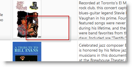
To configure the position of the tooltip, you specify the offset of the tooltip from the mouse pointer in the jQuery igGrid Tooltip API.


The tooltip positioning is managed by the cursorLeftOffset and cursorTopOffset properties. The table below demonstrates the required property settings for achieving the offset shown in the picture above. For details about the properties, refer to the API documentation.
| Property | Setting |
|---|---|
| name | “Tooltips” |
| cursorLeftOffset | 50 |
| cursorTopOffset | 50 |
The following code configures the offset shown in the picture above.
In Javascript:
$("#grid1").igGrid({
    features: [
        {
            name: "Tooltips",
            cursorLeftOffset: 50,
            cursorTopOffset: 50
        }
    ]
});
Note: For information on how to do the same with MVC, see the Enable Tooltips for an igGrid topic.
Following are some other topics you may find useful.
View on GitHub