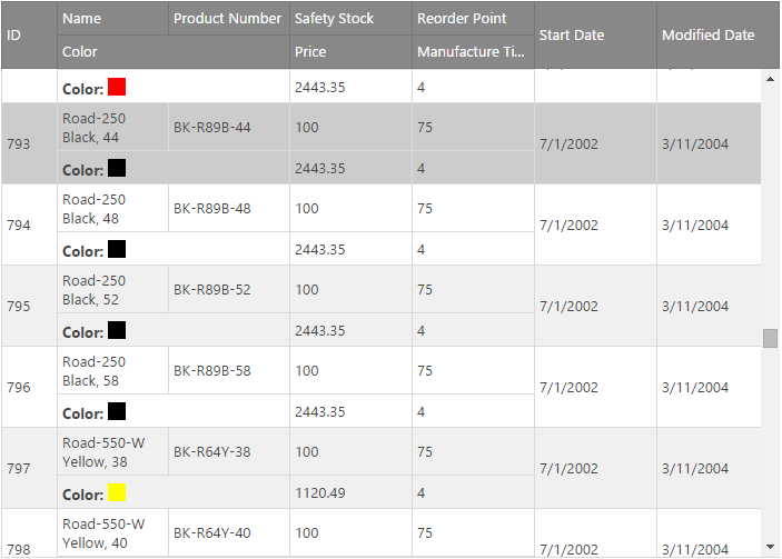
Multi-Row Layout is a feature for the Ignite UI for jQuery™ grid, or igGrid. It allows you to create a complex structure that repeats for each record and contains multiple physical rows with cells in them that can span multiple columns and rows. Such structure allows for greater rendering flexibility for grids with many columns that would otherwise require a horizontal scrollbar or when the data shown is better presented in a non-tabular fashion.
Figure 1: Visual example of a Multi-Row Layout Grid

Note: The Multi-Row Layout feature is implemented as part of the igGrid widget, and therefore follows the standard igGrid lifecycle.
Initializing the Multi-Row Layout is done entirely through the igGrid's column collection. Four new properties are added to the column definition that specify the position and size of the column - rowIndex, columnIndex, rowSpan and colSpan. HTML tables are rendered stricly based on rows and columns and the size of a cell in a Multi-Row Layout grid is based on how many rows and columns it spans. To enable the feature all columns definitions in the column's collection should have rowIndex and columnIndex. The rowSpan and colSpan properties can be omitted in which case they default to a value of 1. The columns definitions should create a matrix of cells that doesn't contain empty spaces and no two cells should occupy the same space. In case any of the two happen a user-friendly initialization exception will be thrown pointing to the issue's origin.
In a Multi-Row Layout grid widths can be defined for only part of the columns. The grid will attempt to make the necessery calculations and fill widths for columns that depend on the width of others leaving those without such relation to be sized by the browser.
To put the information so far into perspective, the Multi-Row Layout in Figure 1 is generated with the following code snippet:
In Javascript:
columns: [
            { headerText: "Company", key: "company", dataType: "string", rowIndex: 0, columnIndex: 0, colSpan: 2 },
            { headerText: "Lifetime Sales", key: "sales_lifetimeSales", dataType: "number", rowIndex: 0, columnIndex: 2, colSpan: 2, rowSpan: 2 },
            { headerText: "Market Potential", key: "sales_marketPotential", dataType: "number", rowIndex: 0, columnIndex: 4, rowSpan: 3, width: "10%" },
            { headerText: "Assets Cash", key: "assets_cash", dataType: "number", rowIndex: 0, columnIndex: 5, width: "10%" },
            { headerText: "Accounts Receivable", key: "assets_accRec", dataType: "number", rowIndex: 0, columnIndex: 6, width: "20%" },
            { headerText: "Country", key: "country", dataType: "string", rowIndex: 1, columnIndex: 0, width: "10%" },
            { headerText: "City", key: "city", dataType: "string", rowIndex: 1, columnIndex: 1, width: "10%" },
            { headerText: "Assets Books", key: "assets_books", dataType: "number", rowIndex: 1, columnIndex: 5, colSpan: 2, rowSpan: 2 },
            { headerText: "Address", key: "address", dataType: "string", rowIndex: 2, columnIndex: 0, colSpan: 2 },
            { headerText: "Quarterly", key: "sales_quarterlySales", dataType: "number", rowIndex: 2, columnIndex: 2, width: "10%" },
            { headerText: "Yearly", key: "sales_yearlySales", dataType: "number", rowIndex: 2, columnIndex: 3, width: "10%" }
]
Note: For cells that span one column the
colSpanproperty is omitted and for those that span one row therowSpanproperty is omitted. Widths are defined for two columns only. The sample below demonstrates how to setup an igGrid with a Multi-Row Layout.API in a Multi-Row Layout Grid
Since Multi-Row Layout changes how cells are rendered and therefore breaks the corelation between the cell's index in a row and its overall position in the layout and because of the fact one record no longer corresponds to a single TR element, a number of changes and considerations were made on how API functions and events works in the context of such grids.
TR elements that are rendered for the record with the specified rowIdTR element at the specified rowIndexTD element at the specified coordinates based on the Multi-Row Layout matrix. This means that cells with row/col spans will be taken into account when determining the element to be returned.TD element specified by the rowId and columnKey.rowId (if a primary key is specified) or recordIndex (if no primary key is specified) and the columnKeyrowId (if a primary key is specified) or recordIndex (if no primary key is specified) and the columnKeyAn additional function is added to the public API that accepts a DOM element and returns information about it in the context of the grid's layout.
getElementInfo - accepts a DOM element and returns an object containing the following properties:
TD/TH) in the DOM TD or TH - the column object in the column collection for that cellFinally, two arguments returned by two igGrid events received some clarification in the context of Multi-Row Layout.
TR element of the clicked cellCOL element in the COLGROUP the cell belongs toTR element of the clicked cellCOL element in the COLGROUP the cell belongs toWhen igGrid is rendered in a multi-row layout mode the following features are supported: Sorting, Filtering, Paging and Updating, as well as virtualization in continuous mode. Enabling any of the other features native to igGrid will result in unexpected behavior or initialization exceptions. The supported features have certain limitations in this mode. They are listed below.
advanced mode. Attempting to use it in simple mode will result in an initialization exception.The following table summarizes the integration between Grid Multi-Row Layout and other igGrid features.
| Feature | Description |
|---|---|
| Updating | In inline editing (editMode is row or cell ) use navigationIndex option to configure the tab order of the editors. Note that the option has no effect when not in edit mode and the default browser tab navigation will be applied in this case. |
View on GitHub