Version

igRadialMenu Visual Elements

Topic Overview

Purpose

This topic provides an overview of the visual elements of the igRadialMenu™ control.

Required background

The following topic is a prerequisite to understanding this topic:

  • igRadialMenu Features: This topic explains the features supported by the control from developer perspective.

In this topic

This topic contains the following sections:

Visual Elements of igRadialMenu Control and Related Properties

Visual elements summary

The following screenshot depicts the visual elements of the igRadialMenu control. Configurable elements are listed after the image.
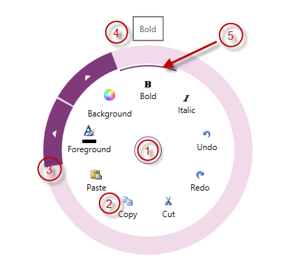
Configurable Visual Elements:

  1. Center Button – either opens and closes the igRadialMenu, or allows access to menu items on the previous level.
  2. Items Area – displays the current level menu items in this area.
  3. Outer Ring – the outer most part of the igRadialMenu, may contain arrows for accessing sub-items
  4. Tooltip – indicates the currently selected menu item.
  5. Selection Arc – highlights the currently hovered menu item and its checked state.

Visual elements and related properties

The following table maps the visual elements of the igRadialMenu control and the properties that configure them.

Visual element Main configurable aspects
Center button
  • CenterButtonBackTemplate
  • CenterButtonContent
  • CenterButtonFill
  • CenterButtonStroke
Items area
  • Items
  • ItemsSource
  • MinWedgeCount
  • RotationInDegrees
  • WedgeIndex
  • WedgeSpan
Outer ring
  • OuterRingFill
  • OuterRingStroke
  • OuterRingThickness
  • OuterRingStrokeThickness
Tooltips
  • IsToolTipEnabled
  • ToolTip
  • ToolTipTemplate
Selection arc
  • IsChecked

Related Content

Topics

The following topic provides additional information related to this topic.

View on GitHub