This topic demonstrates how to enable the igDialog™ footer and header and how to customize them.
The following topics are prerequisites to understanding this topic:
igDialog Overview: The topic introduces the user to the igDialog control’s main features.
Adding igDialog: This topic demonstrates how to add the igDialog control to a web page.
This topic contains the following sections:
The following table lists the configurable aspects of the igDialog header and footer control modules. Additional details are available after the table.
| Configurable aspects | Details | Properties |
|---|---|---|
Enable and configure igDialog header
|
The properties that need to be configured to enable igDialog and customize its elements.
|
|
Enable and configure igDialog footer
|
The properties that need to be configured to enable igDialog and customize its elements.
|
If you want to see how to enable and disable header buttons please review the Minimize and Maximize and Pin topic.
The igDialog API proposes several API properties for modifying its header.
The following table maps the desired header features to property settings:
| In order to: | Use this property: | And set it to: |
|---|---|---|
| Show the igDialog header | showHeader | true |
| Set the igDialog header title | headerText | “HEADER” |
| Set the igDialog header image | imageClass | “clsImage” |
| Set the igDialog close button title | closeButtonTitle | “X” |
| Set the igDialog minimize button title | minimizeButtonTitle | “MIN” |
| Set the igDialog maximize button title | maximizeButtonTitle | “MAX” |
| Set the igDialog pin button title | pinButtonTitle | “PIN” |
| Set the igDialog unpin button title | unpinButtonTitle | “UNPIN” |
| Set the igDialog restore button title | restoreButtonTitle | “RESTORE” |
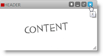
The screenshot below demonstrates how the igDialog looks as a result of the settings above:

Note: The red square at the top is there because of the
clsImagedefined in CSS:.clsImage { background-color: red; width: 5px; height: 5px; }
The igDialog API proposes two API properties for modifying its footer.
The following table maps the desired header features to property settings:
| In order to: | Use this property: | And set it to: |
|---|---|---|
Show the igDialog footer |
showFooter | true |
Set the igDialog footer title |
footerText | “FOOTER” |
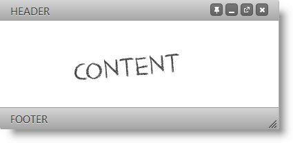
The screenshot below demonstrates how the igDialog looks as a result of the settings above, plus the header setting from the previous paragraph:

The following topics provide additional information related to this topic:
igDialog Overview: The topic introduces the user to the igDialog control’s main features.
Adding igDialog: This topic demonstrates how to add the igDialog control to a web page.
The following samples provide additional information related to this topic:
igDialog icons.View on GitHub