This topic discusses how to configure the column summaries in the igGrid™.
This topic contains the following sections:
The list below includes the required background you need for fully understanding the information in this topic.
The table below lists the configurable[screen elements and] behaviors of the columnSummaries feature of the igGrid control.
| Configurable behavior/feature | Configuration details | Configuration properties |
|---|---|---|
| Summary type | The type of the summary calculationis set through a property. | type |
| Automatic/manual calculation | Calculations can be performed either automatically (immediately after a value is entered) or after the user clicks a button. This functionality is delivered through two rendering modes. | calculateRenderMode |
| Summary compacting | Summaries can be rendered compactly through a special rendering mode. | compactRenderingMode |
| Summary button | A summary button in the header cell, configurable through a dedicated property. | showSummariesButton |
| Summary menu button | Summary menu button - A summary menu button in the footer cell, configurable through a dedicated property. | showDropDownButton |
| Canceling summary calculation | Handle summaryCalculation event and, on some condition, cancel it. |
- |
| Configurable events | For detailed information about these events, refer to their listing in the property reference section: Column Summaries Events (igGrid) |
Note: The predefined summary functions by default are enabled depending on the
dataTypeof the column. For example if you have defined your column’sdataTypeto be “number” or “numeric” than the default summary functions will be: “Count”, “Min”, “Max”, “Sum”, “Avg”(average). If the dataType is “date” or "time", the default summary function will be: “Count”, “Min” and “Max”. Otherwise (if dataType is “string”, “bool” or “object”) the default summary function will be only “Count”.
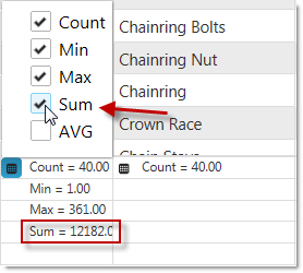
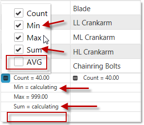
There are two summary types – local and remote. This option specifies if the calculation of the summary should be made on the client, or on the server. If the option is set to local , and the user chooses summary functions, the calculation is made instantly on the browser, but when it is set to remote and the user adds summary functions (the image on the right), the calculation will be sent to the server after the user has finished selecting.
In the picture below, the type is set to local (the image on the left) and type set to remote (the image on the right)
The table below maps the desired configurations to property settings. The properties are accessed through the igGridSummaries options.
| Property | Setting |
|---|---|
| type | local |
In HTML:
<script type="text/javascript">
$(function () {
    $("#grid1").igGrid({
       autoGenerateColumns: true,
       dataSource: adventureWorks,
       responseDataKey: 'Records',
                features: [
                {
                    name: 'Summaries',
                    type: 'local'
                }
            ]
       });
});
</script>
In MVC:
<%= Html.Infragistics().Grid(Model)
        .AutoGenerateColumns(true)
        .Features(feature =>{
      feature.Summaries().Type(OpType.Local);
     }).DataBind().Render()

%>
Related links:
Summaries (Remote Calculation)
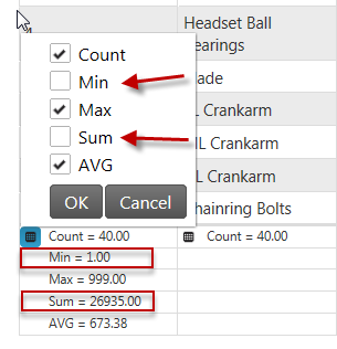
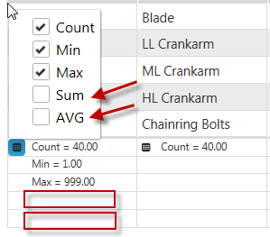
There are two rendering modes defining how calculatins are performed. They are managed by calculateRenderMode property. This option specifies if the calculation should be made instantly or after the OK button is clicked. If the option is set to onselect, no OK/Cancel buttons appear (the image on the right), when check/uncheck summary it’s updated instantly and when we click outside the drop down menu that means we are ready with our choice. When option is set to okcancelbuttons (the image on the left) when we check/uncheck summaries, they are not calculated, but just selected/unselected. When we click outside the drop down that operation is equal to cancel button click.
In the pictures below, the option calculateRenderMode is set to "okcancelbuttons" (the image on the left) and “onselect” (the image on the right).
The table below maps the desired configurations to property settings. The properties are accessed through the igGridSummaries options.
| Property | Setting |
|---|---|
| calculateRenderMode | onselect |
In HTML:
<script type="text/javascript">
$(function () {
    $("#grid1").igGrid({
       autoGenerateColumns: true,
       dataSource: adventureWorks,
       responseDataKey: 'Records',
                features: [
                {
                    name: 'Summaries',
                    calculateRenderMode: 'onselect'
                }
            ]
    });
});
</script>
In MVC:
<%= Html.Infragistics().Grid(Model)
        .AutoGenerateColumns(true)
        .Features(feature => { feature.Summaries().CalculateRenderMode(SummaryCalculateRenderMode.OnSelect); }).DataBind().Render()
%>
Setting the rendering mode using igGridSummaries options:
In HTML:
<script type="text/javascript">
    $(function () {
      $("#grid1").igGridSummaries('option', 'calculateRenderMode', 'onselect');
    });
</script>
This feature specifies how to compact the summaries that are rendered. It is controlled by compactRenderingMode option and it has three possible values – true (the upper image), false (the middle image), and auto (the lower image). When true is set - the summaries may be rendered compactly, even mixing different summaries on the same line.
The false option ensures that each summary type is occupying a separate line. And if the option is set to auto, it will use true if the maximum number of visible summaries is 1 and false – otherwise.
In the pictures below, compactRenderingMode is set to true (the upper image), false (the middle image), and auto (the lower image).
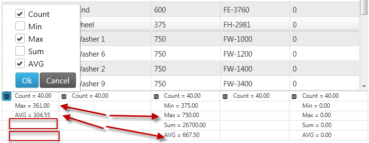
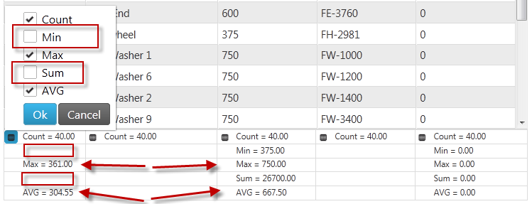

The table below maps the desired configurations to property settings.
The properties are accessed through the igGridSummaries options.
| Property | Setting |
|---|---|
| compactRenderingMode | true |
In HTML:
<script type="text/javascript">
$(function () {
    $("#grid1").igGrid({
       autoGenerateColumns: true,
       dataSource: adventureWorks,
       responseDataKey: 'Records',
                features: [
                {
                    name: 'Summaries',
                    compactRenderingMode: true
                }
            ]
    });
});
</script>
In ASPX:
<%= Html.Infragistics().Grid(Model)
        .AutoGenerateColumns(true)
        .Features(feature =>{ feature.Summaries().CompactRenderingMode(SummaryCompactRenderingMode.True); }).DataBind().Render()
%>
Setting the compact mode using igGridSummaries options.
In HTML:
<script type="text/javascript">
    $(function () {
      $("#grid1").igGridSummaries('option', 'compactRenderingMode', true);
    });
</script>
The showSummariesButton property enables you to show/hide a summary button in the header of a column. When set to true (the upper image), the user can click to hide/show the summaries in the grid. When the showSummariesButton option is set to false (the lower image) no buttons appear.
In the pictures below, the showSummariesButton option is set to true (the upper image) and false (the lower image).


The table below maps the desired configurations to property settings.
The properties are accessed through the igGridSummaries options.
| Property | Setting |
|---|---|
| showSummariesButton | true |
In HTML:
<script type="text/javascript">
$(function () {
    $("#grid1").igGrid({
       autoGenerateColumns: true,
       dataSource: adventureWorks,
       responseDataKey: 'Records',
                features: [
                {
                    name: 'Summaries',
                    showSummariesButton: true
                }
            ]
    });
});
</script>
In ASPX:
<%= Html.Infragistics().Grid(Model)
        .AutoGenerateColumns(true)
        .Features(feature =>{
           feature.Summaries().ShowSummariesButton(true);
            }).DataBind().Render()
%>
Set the summary button using igGridSummaries options:
In HTML:
<script type="text/javascript">
    $(function () {
      $("#grid1").igGridSummaries('option', 'showSummariesButton', true);
    });
</script>
The showDropDownButton property enables you to show/hide a button that open a menu with the available button summaries. If this option is set to true (the upper image), the summary menu button is available.
When the showDropDownButton property is set to false (the lower image), the the summary menu button is not visible in the grid. This may be useful when you want to show specific summaries and do not want the user to be able to change them after initialization.
In the pictures below, showDropDownButton is set true (the upper image) and false (the lower image).


The table below maps the desired configurations to property settings. The properties are accessed through the igGridSummaries options.
| Property | Setting |
|---|---|
| showDropDownButton | true |
In HTML:
<script type="text/javascript">
$(function () {
    $("#grid1").igGrid({
       autoGenerateColumns: true,
       dataSource: adventureWorks,
       responseDataKey: 'Records',
                features: [
                {
                    name: 'Summaries',
                    showDropDownButton: true
                }
            ]
     });
});
</script>
In ASPX:
<%= Html.Infragistics().Grid(Model)
        .AutoGenerateColumns(true)
        .Features(feature =>{
           feature.Summaries().ShowDropDownButton(true);
            }).DataBind().Render()
%>
Set the dropdown button using igGridSummaries options.
In HTML:
<script type="text/javascript">
    $(function () {
      $("#grid1").igGridSummaries('option', 'showDropDownButton', true);
    });
</script>
By handling the summariesCalculating event, a summary calculation can be cancelled.
Following is a conceptual overview of the process:
Handle the summariesCalculating event.
Define a handler function.
Define a function that will be called when the summariesCalculating event fires.
In HTML and JavaScript:
<script type="text/javascript">
    function gridSummariesCalculating (evt, ui) { ... };
</script>
Set the handler to the summariesCalculating event of the igGrid.
Once you have a handler defined, it needs to be set as the handler for the summariesCalculating event. In jQuery, this can be done when the widget is instantiated.
In ASP.NET MVC, the event should be attached using the jQuery live or bind API. Using the live or bind API is an option for attaching the event in a pure jQuery implementation as well. The type for this event is 'iggridsummariessummariescalculating'.
In HTML:
$(function () {
    $("#grid1").igGrid({
       autoGenerateColumns: true,
       dataSource: adventureWorks,
       responseDataKey: 'Records',
                features: [
                {
                    name: 'Summaries',
                    showDropDownButton: true,
                    summariesCalculating: gridSummariesCalculating
                }
            ]
      });
});
In JavaScript
$("#grid1").live("iggridsummariessummariescalculating ", gridSummariesCalculating);
Cancel the event by returning false
In HTML and JavaScript:
<script type="text/javascript">
    function gridSummariesCalculating (evt, ui) {
       if (conditionNotMet)
          return false;
     };
</script>
By defining a custom summaryOperands object (summaryOperands with type custom) you point the Summaries feature to a custom function to calculate the row summary. When the compactRenderingMode option is set to false, the results from both the predefined and the custom methods are positioned in summary rows according to their sort order. The sample below has two custom summary functions (countTrueValues, countFalseValues) each calculating the number of true or false values in a boolean column. Those summary functions are then used for the "Make Flag" column.
Following are some other topics you may find useful.
View on GitHub