This topic discusses how to configure row selection in the igGrid.
This topic contains the following sections:
The table below lists the required background you need for fully understanding the information in this topic.
The rowSelectors widget of the igGrid™ control exposes a lot of configurable options. The table below lists the configurable screen elements and behaviors manageable through the widget. For some of the behaviors/features, detailed explanations and examples are provided in the blocks following the chart.
| Configurable behavior / feature | Configuration details | Configuration properties |
|---|---|---|
| Multiple rows selection | By default, the RowSelectors widget has row numbering enabled. | – |
| Selection checkboxes | Determines whether the row selectors column should contain checkboxes | enableCheckBoxes |
| Row numbering | The row selectors column can contain row numbers if a property is enabled. | enableRowNumbering |
| Canceling the check box state changing event | Hook to checkBoxStateChanging event and cancel it on some condition. |
– |
| Row numbering seed | The seed is added to the default numbering. | rowNumberingSeed |
| Width of the row selectors column. | The width of row selectors column is configurable by setting a property. | rowSelectorColumnWidth |
| Configurable events | For information about these events, refer to their listing in the property reference section: igGridRowSelectors Events | |
| Require Selection | Requires the selection feature to be enabled. If selection is not enabled, an exception is thrown | requireSelection |
Selecting cells or rows with RowSelectors requires initializing the Selection feature for the grid. RowSelectors do not initialize the Selection feature automatically and expects you to enable it if needed. Without the Selection feature, RowSelectors can still be used, for example, for their row numbering functionality. In the example below, multiple-selection is enabled. Red arrows show row selectors column.
In the picture below, RowSelectors and multiple Selection features are enabled.

In HTML:
<script type="text/javascript">
    $(function () {
        $("#grid").igGrid({
            autoGenerateColumns: true,
            dataSource: source,
            features: [
                {
                    name: 'RowSelectors'
                },
                {
                    name: 'Selection',
                    mode: "cell",
                    multipleSelection: true
                }
            ]
        });
    });
</script>
In Razor:
@(Html.Infragistics().Grid(Model)
    .AutoGenerateColumns(true)
    .Features(feature =>        {
        feature.Selection().MultipleSelection(true);
        feature.RowSelectors();
    })
    .DataBind()
    .Render()
)
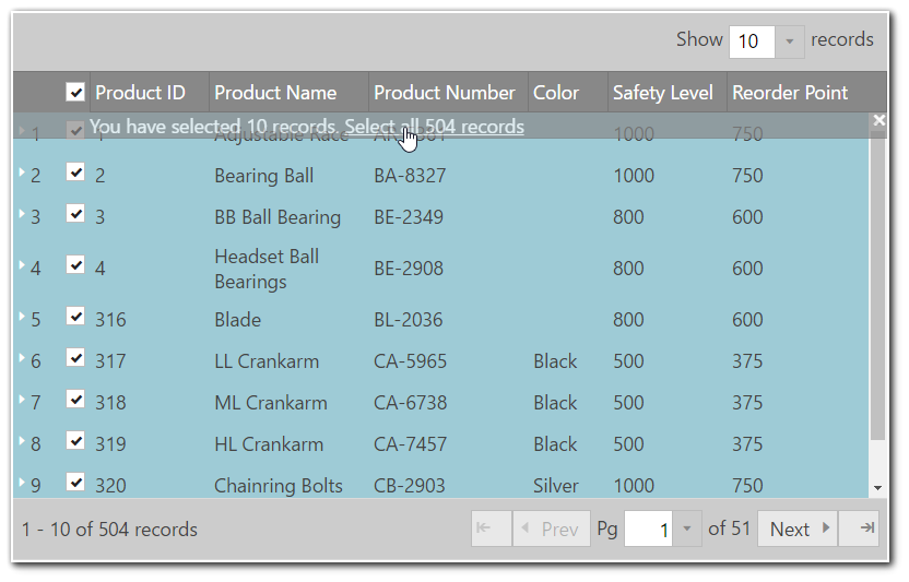
By default the header checkbox, available in multiple selection mode, checks all rows from the current data view. Now the grid Row Selectors along with Paging feature provides the ability to select all records across all pages using the option "enableSelectAllForPaging" (set to true by default). In case of local Paging when header checkbox is clicked an overlay is displayed suggesting the end user to select/deselect the rows from all pages (see the screenshot below).
Note: "Select All" functionality does not work for remote Paging. Clicking on the header checkbox will only select the rows from the current page.
The picture below demonstrates the "Select All" functionality.

The table below maps the desired configurations to property settings. The properties are accessed through the igGridRowSelectors options.
| Property | Setting |
|---|---|
| enableSelectAllForPaging | true |
| enableCheckBoxes | true |
| multipleSelection | true |
In HTML:
<script type="text/javascript">
    $(function () {
        $("#grid").igGrid({
            autoGenerateColumns: true,
            dataSource: source,
            features: [
                {
                    name: 'RowSelectors',
                    enableCheckBoxes: true,
                    enableSelectAllForPaging: true
                },
                {
                    name: 'Selection',
                    multipleSelection: true
                },
                {
                    name: 'Paging',
                    type: "local",
                    pageSize: 10
                }
            ]
        });
    });
</script>
In Razor:
@(Html.Infragistics().Grid(Model)
    .AutoGenerateColumns(true)
    .Features(feature =>        {
        feature.Selection().MultipleSelection(true);
          feature.RowSelectors()
            .EnableCheckBoxes(true)
            .EnableSelectAllForPaging(true);
        feature.Paging().PageSize(10);
    })
    .DataBind()
    .Render()
)
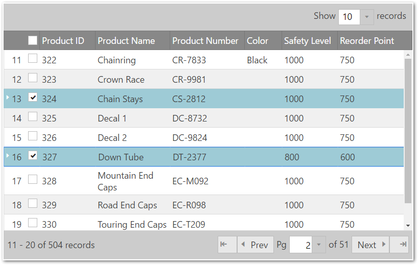
Selection checkboxes are added by setting the enableCheckBoxes property to true. It is recommended, if enabling the checkboxes feature, to use multiple-selection so the user won’t need to hold Ctrl key when selecting multiple rows.
When multiple-selection is enabled a checkbox will display in the row selectors column header. This checkbox enables selection/deselection of all the rows at once (in case when Paging feature is enabled selects/deselects only the rows from the current page).
Note: Enabling checkboxes forces
igGridSelectionto use "row" selection mode.
In the picture below demonstrates a grid with both checkboxes and Paging enabled.

The table below maps the desired configurations to property settings. The properties are accessed through the igGridRowSelectors options.
| Property | Setting |
|---|---|
| enableCheckBoxes | true |
In HTML:
<script type="text/javascript">
    $(function () {
        $("#grid").igGrid({
            autoGenerateColumns: true,
            dataSource: source,
            features: [
                {
                    name: 'RowSelectors',
                    enableCheckBoxes: true
                },
                {
                    name: 'Selection',
                    multipleSelection: true
                }
            ]
        });
    });
</script>
In Razor:
@(Html.Infragistics().Grid(Model)
    .AutoGenerateColumns(true)
    .Features(feature =>         {
        feature.Selection().MultipleSelection(true);
        feature.RowSelectors().EnableCheckBoxes(true);
     })
    .DataBind()
    .Render()
)
The row selector column in the grid can be used to display the sequential numbers of the rows. This is managed through the enableRowNumbering option of the RowSelectors feature.
In the picture demonstrates a grid with, row numbering enabled.

The table below maps the desired configurations to property settings. The properties are accessed through the igGridRowSelectors options.
To set a start value different from 0 use the rowNumberingSeed option.
| Property | Setting |
|---|---|
| enableRowNumbering | true |
| rowNumberingSeed | 0 |
In HTML:
<script type="text/javascript">
    $(function () {
        $("#grid").igGrid({
            autoGenerateColumns: true,
            dataSource: source,
            features: [
                {
                    name: 'RowSelectors',
                    enableRowNumbering: true
                }
            ]
        });
    });
</script>
In Razor:
@(Html.Infragistics().Grid(Model)
    .AutoGenerateColumns(true)
    .Features(feature =>        {
        feature.Selection().MultipleSelection(true);
        feature.RowSelectors().EnableRowNumbering(true);
    })
    .DataBind()
    .Render()
)
By handling the checkBoxStateChanging event, a checkbox selection can be canceled.
Following is a conceptual overview of the process:
checkBoxStateChanging eventHandle the checkBoxStateChanging event.
Define a function that will be called when the checkBoxStateChanging event fires.
In Javascript:
function gridcheckboxStateChanging (evt, ui) {

};
Set the handler to the rowSelectorClicked event of the igGrid.
Once you have a handler defined, it needs to be set as the handler for the gridcheckboxStateChanging event.
In jQuery, this can be done when the widget is instantiated.
In ASP.NET MVC, the event should be attached using the jQuery delegate() or bind() API. The type for this event is ‘iggridrowselectorscheckboxstatechanging'.
In Javascript:
$(function () {
    $("#grid1").igGrid({
        autoGenerateColumns: true,
        dataSource: adventureWorks,
        responseDataKey: 'Records',
        features: [
            {
                name: 'RowSelectors',
                enableCheckBoxes: true,
                checkBoxStateChanging: "gridcheckboxStateChanging"
            },
            {
                name: 'Selection'
            }
        ]
    });
});
Cancel the event.
Cancel the event by returning false.
In Javascript:
 function gridcheckboxStateChanging (evt, ui) {
     if (conditionNotMet)
         return false;
 };
Following are some other topics you may find useful.
This sample shows how to configure a Row Selectors in the igGrid.
View on GitHub