
ui.igLinearGauge
Code Sample
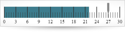
<!DOCTYPE html><html><head> <title></title> <!-- Ignite UI Required Combined CSS Files --> <link href="../../igniteui/css/themes/infragistics/infragistics.theme.css" rel="stylesheet" /> <link href="../../igniteui/css/structure/infragistics.css" rel="stylesheet" /> <!-- Used to style the API Viewer and Explorer UI --> <link href="../../css/apiviewer.css" rel="stylesheet" type="text/css" /> <script src="../../js/modernizr.min.js"></script> <script src="../../js/jquery.min.js"></script> <script src="../../js/jquery-ui.min.js"></script> <!-- Ignite UI Required Combined JavaScript Files --> <script src="../../igniteui/js/infragistics.core.js"></script> <script src="../../igniteui/js/infragistics.dv.js"></script></head><body> <div id="lineargauge" ></div> <script type="text/javascript"> $(function () { $("#lineargauge").igLinearGauge({ height: "80px", width: "100%", value: 27, maximumValue: 30, ranges: [{startValue:0, endValue:22, name:"target"}] }); }); </script></body></html> |
Related Samples
Related Topics
Dependencies
Inherits
-
backingBrush
- Type:
- string
- Default:
- null
Gets or sets the brush to use to fill the backing of the linear gauge.
Code Sample
// Initialize$(".selector").igLinearGauge({backingBrush:"#164F6D"});// GetvarbackingBrush = $(".selector").igLinearGauge("option","backingBrush");// Set$(".selector").igLinearGauge("option","backingBrush","#164F6D"); -
backingInnerExtent
- Type:
- number
- Default:
- 0
Gets or sets the inner extent of the linear gauge backing.
Code Sample
// Initialize$(".selector").igLinearGauge({backingInnerExtent: 0.3});// GetvarbackingInnerExtent = $(".selector").igLinearGauge("option","backingInnerExtent");// Set$(".selector").igLinearGauge("option","backingInnerExtent", 0.3); -
backingOuterExtent
- Type:
- number
- Default:
- 1
Gets or sets the outer extent of the linear gauge backing.
Code Sample
// Initialize$(".selector").igLinearGauge({backingOuterExtent: 0.65});// GetvarbackingOuterExtent = $(".selector").igLinearGauge("option","backingOuterExtent");// Set$(".selector").igLinearGauge("option","backingOuterExtent", 0.65); -
backingOutline
- Type:
- string
- Default:
- null
Gets or sets the brush to use for the outline of the backing.
Code Sample
// Initialize$(".selector").igLinearGauge({backingOutline:"#164F6D"});// GetvarbackingOutline = $(".selector").igLinearGauge("option","backingOutline");// Set$(".selector").igLinearGauge("option","backingOutline","#164F6D"); -
backingStrokeThickness
- Type:
- number
- Default:
- 2
Gets or sets the stroke thickness of the backing outline.
Code Sample
// Initialize$(".selector").igLinearGauge({backingStrokeThickness: 3});// GetvarbackingStrokeThickness = $(".selector").igLinearGauge("option","backingStrokeThickness");// Set$(".selector").igLinearGauge("option","backingStrokeThickness", 3); -
font
- Type:
- string
- Default:
- null
Gets or sets the font.
Code Sample
// Initialize$(".selector").igLinearGauge({font:"20px Georgia"});// Getvarfont = $(".selector").igLinearGauge("option","font");// Set$(".selector").igLinearGauge("option","font","20px Georgia"); -
fontBrush
- Type:
- string
- Default:
- null
Gets or sets the brush to use for the label font.
Code Sample
// Initialize$(".selector").igLinearGauge({fontBrush:"#164F6D"});// GetvarfontBrush = $(".selector").igLinearGauge("option","fontBrush");// Set$(".selector").igLinearGauge("option","fontBrush","#164F6D"); -
height
- Type:
- enumeration
- Default:
- null
The height of the gauge. It can be set as a number in pixels, string (px) or percentage (%).
Members
- string
- The widget height can be set in pixels (px) and percentage (%).
- number
- The widget height can be set as a number.
Code Sample
// Initialize$(".selector").igLinearGauge({height:"150px"});// Getvarheight = $(".selector").igLinearGauge("option","height");// Set$(".selector").igLinearGauge("option","height","150px"); -
interval
- Type:
- number
- Default:
- 0
Gets or sets the interval to use for the scale.
Code Sample
// Initialize$(".selector").igLinearGauge({interval: 15});// Getvarinterval = $(".selector").igLinearGauge("option","interval");// Set$(".selector").igLinearGauge("option","interval", 15); -
isNeedleDraggingEnabled
- Type:
- bool
- Default:
- false
Gets or sets whether needle dragging is enabled or not.
Code Sample
// Initialize$(".selector").igLinearGauge({isNeedleDraggingEnabled:true});// GetvarisDraggingEnabled = $(".selector").igLinearGauge("option","isNeedleDraggingEnabled");// Set$(".selector").igLinearGauge("option","isNeedleDraggingEnabled",true); -
isScaleInverted
- Type:
- bool
- Default:
- false
Gets or sets a value indicating whether the scale is inverted.
When the scale is inverted the direction in which the scale values increase is right to left.Code Sample
// Initialize$(".selector").igLinearGauge({isScaleInverted:true});// GetvarisScaleInverted = $(".selector").igLinearGauge("option","isScaleInverted");// Set$(".selector").igLinearGauge("option","isScaleInverted",true); -
labelExtent
- Type:
- number
- Default:
- 0
Gets or sets the position at which to put the labels as a value from 0 to 1, measured from the bottom of the scale.
Values further from zero than 1 can be used to hide the labels of the linear gauge.Code Sample
// Initialize$(".selector").igLinearGauge({labelExtent: 0.65});// GetvarlabelExtent = $(".selector").igLinearGauge("option","labelExtent");// Set$(".selector").igLinearGauge("option","labelExtent", 0.65); -
labelInterval
- Type:
- number
- Default:
- 0
Gets or sets the interval to use for rendering labels. This defaults to be the same interval as the tickmarks on the scale.
Code Sample
// Initialize$(".selector").igLinearGauge({labelInterval: 15});// GetvarlabelInterval = $(".selector").igLinearGauge("option","labelInterval");// Set$(".selector").igLinearGauge("option","labelInterval", 15); -
labelsPostInitial
- Type:
- number
- Default:
- 0
A value to start adding labels, added to the scale's MinimumValue.
Code Sample
// Initialize$(".selector").igLinearGauge({labelsPostInitial: 5000});// GetvarlabelsPostInitial = $(".selector").igLinearGauge("option","labelsPostInitial");// Set$(".selector").igLinearGauge("option","labelsPostInitial", 5000); -
labelsPreTerminal
- Type:
- number
- Default:
- 0
A value to stop adding labels, subtracted from the scale's MaximumValue.
Code Sample
// Initialize$(".selector").igLinearGauge({labelsPreTerminal: 5000});// GetvarlabelsPreTerminal = $(".selector").igLinearGauge("option","labelsPreTerminal");// Set$(".selector").igLinearGauge("option","labelsPreTerminal", 5000); -
maximumValue
- Type:
- number
- Default:
- 100
Gets or sets the maximum value of the scale.
Code Sample
// Initialize$(".selector").igLinearGauge({maximumValue: 5000});// GetvarmaximumValue = $(".selector").igLinearGauge("option","maximumValue");// Set$(".selector").igLinearGauge("option","maximumValue", 5000); -
minimumValue
- Type:
- number
- Default:
- 0
Gets or sets the minimum value of the scale.
Code Sample
// Initialize$(".selector").igLinearGauge({minimumValue: 500});// GetvarminimumValue = $(".selector").igLinearGauge("option","minimumValue");// Set$(".selector").igLinearGauge("option","minimumValue", 500); -
minorTickBrush
- Type:
- string
- Default:
- null
Gets or sets the brush to use for the minor tickmarks.
Code Sample
// Initialize$(".selector").igLinearGauge({minorTickBrush:"blue"});// GetvarminorTickBrush = $(".selector").igLinearGauge("option","minorTickBrush");// Set$(".selector").igLinearGauge("option","minorTickBrush","blue"); -
minorTickCount
- Type:
- number
- Default:
- 3
Gets or sets the number of minor tickmarks to place between major tickmarks.
Code Sample
// Initialize$(".selector").igLinearGauge({minorTickCount: 5});// GetvarminorTickCount = $(".selector").igLinearGauge("option","minorTickCount");// Set$(".selector").igLinearGauge("option","minorTickCount", 5); -
minorTickEndExtent
- Type:
- number
- Default:
- 0.35
Gets or sets the position at which to stop rendering the minor tickmarks as a value from 0 to 1, measured from the front/bottom of the linear gauge.
Values further from zero than 1 can be used to make this extend further than the normal size of the linear gauge.Code Sample
// Initialize$(".selector").igLinearGauge({minorTickEndExtent: .5});// GetvarminorTickEndExtent = $(".selector").igLinearGauge("option","minorTickEndExtent");// Set$(".selector").igLinearGauge("option","minorTickEndExtent", .5); -
minorTickStartExtent
- Type:
- number
- Default:
- 0.05
Gets or sets the position at which to start rendering the minor tickmarks as a value from 0 to 1, measured from the front/bottom of the linear gauge.
Values further from zero than 1 can be used to make this extend further than the normal size of the linear gauge.Code Sample
// Initialize$(".selector").igLinearGauge({minorTickStartExtent: .05});// GetvarminorTickStartExtent = $(".selector").igLinearGauge("option","minorTickStartExtent");// Set$(".selector").igLinearGauge("option","minorTickStartExtent", .05); -
minorTickStrokeThickness
- Type:
- number
- Default:
- 1
Gets or sets the stroke thickness to use when rendering minor ticks.
Code Sample
// Initialize$(".selector").igLinearGauge({minorTickStrokeThickness: 4});// GetvarminorTickStrokeThickness = $(".selector").igLinearGauge("option","minorTickStrokeThickness");// Set$(".selector").igLinearGauge("option","minorTickStrokeThickness", 4); -
needleBreadth
- Type:
- number
- Default:
- 6
Gets or sets the needle breadth.
Code Sample
// Initialize$(".selector").igLinearGauge({needleBreadth: 4});// GetvarneedleBreadth = $(".selector").igLinearGauge("option","needleBreadth");// Set$(".selector").igLinearGauge("option","needleBreadth", 4); -
needleBrush
- Type:
- string
- Default:
- null
Gets or sets the brush to use for needle element.
Code Sample
// Initialize$(".selector").igLinearGauge({needleBrush:"green"});// GetvarneedleBrush = $(".selector").igLinearGauge("option","needleBrush");// Set$(".selector").igLinearGauge("option","needleBrush","green"); -
needleInnerBaseWidth
- Type:
- number
- Default:
- 0
Gets or sets the width of the needle's inner base.
Code Sample
// Initialize$(".selector").igLinearGauge({needleInnerBaseWidth: .5});// GetvarneedleInnerBaseWidth = $(".selector").igLinearGauge("option","needleInnerBaseWidth");// Set$(".selector").igLinearGauge("option","needleInnerBaseWidth", .5); -
needleInnerExtent
- Type:
- number
- Default:
- 0
Gets or sets the position at which to start rendering the needle geometry, measured from the front/bottom of the linear gauge as a value from 0 to 1.
Values further from zero than 1 can be used to make this extend further than the normal size of the linear gauge.Code Sample
// Initialize$(".selector").igLinearGauge({needleInnerExtent: .5});// GetvarneedleInnerExtent = $(".selector").igLinearGauge("option","needleInnerExtent");// Set$(".selector").igLinearGauge("option","needleInnerExtent", .5); -
needleInnerPointExtent
- Type:
- number
- Default:
- 0
Gets or sets the extent of the needle's inner point.
Code Sample
// Initialize$(".selector").igLinearGauge({needleInnerPointExtent: .5});// GetvarneedleInnerPointExtent = $(".selector").igLinearGauge("option","needleInnerPointExtent");// Set$(".selector").igLinearGauge("option","needleInnerPointExtent", .5); -
needleInnerPointWidth
- Type:
- number
- Default:
- 0
Gets or sets the width of the needle's inner point.
Code Sample
// Initialize$(".selector").igLinearGauge({needleInnerPointWidth: .5});// GetvarneedleInnerPointWidth = $(".selector").igLinearGauge("option","needleInnerPointWidth");// Set$(".selector").igLinearGauge("option","needleInnerPointWidth", .5); -
needleName
- Type:
- string
- Default:
- null
Gets or sets the name used for needle.
Code Sample
// Initialize$(".selector").igLinearGauge({needleName:"Value: "});// GetvarneedleName = $(".selector").igLinearGauge("option","needleName");// Set$(".selector").igLinearGauge("option","needleName","Value: "); -
needleOuterBaseWidth
- Type:
- number
- Default:
- 0
Gets or sets the width of the needle's outer base.
Code Sample
// Initialize$(".selector").igLinearGauge({needleOuterBaseWidth: .5});// GetvarneedleOuterBaseWidth = $(".selector").igLinearGauge("option","needleOuterBaseWidth");// Set$(".selector").igLinearGauge("option","needleOuterBaseWidth", .5); -
needleOuterExtent
- Type:
- number
- Default:
- 0
Gets or sets the position at which to stop rendering the needle geometry as a value from 0 to 1 measured from the front/bottom of the linear gauge.
Values further from zero than 1 can be used to make this extend further than the normal size of the linear gauge.Code Sample
// Initialize$(".selector").igLinearGauge({needleOuterExtent: .5});// GetvarneedleOuterExtent = $(".selector").igLinearGauge("option","needleOuterExtent");// Set$(".selector").igLinearGauge("option","needleOuterExtent", .5); -
needleOuterPointExtent
- Type:
- number
- Default:
- 0
Gets or sets the extent of the needle's outer point.
Code Sample
// Initialize$(".selector").igLinearGauge({needleOuterPointExtent: .5});// GetvarneedleOuterPointExtent = $(".selector").igLinearGauge("option","needleOuterPointExtent");// Set$(".selector").igLinearGauge("option","needleOuterPointExtent", .5); -
needleOuterPointWidth
- Type:
- number
- Default:
- 0
Gets or sets the width of the needle's outer point.
Code Sample
// Initialize$(".selector").igLinearGauge({needleOuterPointWidth: .5});// GetvarneedleOuterPointWidth = $(".selector").igLinearGauge("option","needleOuterPointWidth");// Set$(".selector").igLinearGauge("option","needleOuterPointWidth", .5); -
needleOutline
- Type:
- string
- Default:
- null
Gets or sets the brush to use for the outline of needle element.
Code Sample
// Initialize$(".selector").igLinearGauge({needleOutline:"green"});// GetvarneedleOutline = $(".selector").igLinearGauge("option","needleOutline");// Set$(".selector").igLinearGauge("option","needleOutline","green"); -
needleShape
- Type:
- enumeration
- Default:
- null
Gets or sets the shape to use when rendering the needle from a number of options.
Members
- custom
- Type:string
- .
- rectangle
- Type:string
- .
- triangle
- Type:string
- .
- needle
- Type:string
- .
- trapezoid
- Type:string
Code Sample
// Initialize$(".selector").igLinearGauge({needleShape:"triangle"});// GetvarneedleShape = $(".selector").igLinearGauge("option","needleShape");// Set$(".selector").igLinearGauge("option","needleShape","trapezoid"); -
needleStrokeThickness
- Type:
- number
- Default:
- 1
Code Sample
// Initialize$(".selector").igLinearGauge({needleStrokeThickness: .5});// GetvarneedleStrokeThickness = $(".selector").igLinearGauge("option","needleStrokeThickness");// Set$(".selector").igLinearGauge("option","needleStrokeThickness", .5); -
needleToolTipTemplate
- Type:
- string
- Default:
- null
Gets or sets the needle's tooltip template.
Code Sample
<script id="myNeedleToolTipTemplateScript"type="text/x-jquery-tmpl"><div class='ui-lineargauge-needle-tooltip'style='background-color: ${itemBrush};'><span>${label}</span></div></script>// Initialize$(".selector").igLinearGauge({showToolTip:true,needleToolTipTemplate:"myNeedleToolTipTemplateScript"});// GetvarneedleToolTipTemplate = $(".selector").igLinearGauge("option","needleToolTipTemplate");// Set$(".selector").igLinearGauge("option","needleToolTipTemplate","myNeedleToolTipTemplateScript"); -
orientation
- Type:
- enumeration
- Default:
- horizontal
Gets or sets the orientation of the scale.
Members
- horizontal
- Type:string
- .
- vertical
- Type:string
Code Sample
// Initialize$(".selector").igLinearGauge({orientation:"vertical"});// Getvarorientation = $(".selector").igLinearGauge("option","orientation");// Set$(".selector").igLinearGauge("option","orientation","vertical"); -
rangeBrushes
- Type:
- object
- Default:
- null
Gets or sets a collection of brushes to be used as the palette for linear gauge ranges.
The value provided should be an array of css color strings or JavaScript objects defining gradients. Optionally the first element can be a string reading "RGB" or "HSV" to specify the interpolation mode of the collection.Code Sample
// Initialize$(".selector").igLinearGauge({rangeBrushes: ["#164F6D","green","#AF3","yellow"],});// GetvarrangeBrushes = $(".selector").igLinearGauge("option","rangeBrushes");// Set$(".selector").igLinearGauge("option","rangeBrushes", ["#164F6D","green","#AF3","yellow"]); -
rangeInnerExtent
- Type:
- number
- Default:
- 0.05
Gets or sets the position at which to start rendering the ranges, measured from the front/bottom of the control as a value from 0 to 1.
Values further from zero than 1 can be used to make this extend further than the normal size of the linear gauge.Code Sample
// Initialize$(".selector").igLinearGauge({rangeInnerExtent: 0.4,});// GetvarrangeInnerExtent = $(".selector").igLinearGauge("option","rangeInnerExtent");// Set$(".selector").igLinearGauge("option","rangeInnerExtent", 0.4); -
rangeOuterExtent
- Type:
- number
- Default:
- 0.65
Gets or sets the position at which to stop rendering the range as a value from 0 to 1 measured from the front/bottom of the linear gauge.
Values further from zero than 1 can be used to make this extend further than the normal size of the linear gauge.Code Sample
// Initialize$(".selector").igLinearGauge({rangeOuterExtent: 0.4,});// GetvarrangeOuterExtent = $(".selector").igLinearGauge("option","rangeOuterExtent");// Set$(".selector").igLinearGauge("option","rangeOuterExtent", 0.4); -
rangeOutlines
- Type:
- object
- Default:
- null
Gets or sets a collection of brushes to be used as the palette for linear gauge outlines.
The value provided should be an array of css color strings or JavaScript objects defining gradients. Optionally the first element can be a string reading "RGB" or "HSV" to specify the interpolation mode of the collection.Code Sample
// Initialize$(".selector").igLinearGauge({rangeOutlines: ["#164F6D","green","#AF3","yellow"],});// GetvarrangeOutlines = $(".selector").igLinearGauge("option","rangeOutlines");// Set$(".selector").igLinearGauge("option","rangeOutlines", ["#164F6D","green","#AF3","yellow"]); -
ranges
- Type:
- array
- Default:
- []
- Elements Type:
- object
Gets or sets the scale ranges to render on the linear gauge.
Code Sample
// Initialize$(".selector").igLinearGauge({ranges: [{name:'bad',startValue: 0,endValue: 50},{name:'acceptable',startValue: 50,endValue: 80},{name:'good',startValue: 80,endValue: 100}]});// Getvarranges = $(".selector").igLinearGauge("option","ranges");// Set$(".selector").igLinearGauge("option","ranges", [{name:'bad',startValue: 0,endValue: 50},{name:'acceptable',startValue: 50,endValue: 80},{name:'good',startValue: 80,endValue: 100}]);-
brush
- Type:
- string
- Default:
- null
Gets or sets the brush to use to fill the range.
Code Sample
//Initialize$(".selector").igLinearGauge({ranges: [{ name:"range1", brush:"rgba(164, 189, 41, 1)"}]});//Getvarranges = $(".selector").igLinearGauge("option","ranges");varbrush = ranges[0].brush;//Set$(".selector").igLinearGauge("option","ranges", [{name:"range1", brush:"red"}]); -
endValue
- Type:
- number
- Default:
- 0
Gets or sets the value at which the range ends along the scale.
Code Sample
//Initialize$(".selector").igLinearGauge({ranges: [{ name:"range1", endValue: 50 }]});//Getvarranges = $(".selector").igLinearGauge("option","ranges");varendValue = ranges[0].endValue;//Set$(".selector").igLinearGauge("option","ranges", [{name:"range1", endValue: 50 }]); -
innerEndExtent
- Type:
- number
- Default:
- 0
Gets or sets the distance measured from the front/bottom of the bullet graph (from 0 to 1) at which to end rendering the inner edge of the range.
Values further from zero than 1 can be used to make this extend further than the normal width/height of the bullet graph.Code Sample
//Initialize$(".selector").igLinearGauge({ranges: [{ name:"range1", innerEndExtent: 0.2 }]});//Getvarranges = $(".selector").igLinearGauge("option","ranges");varinnerEndExtent = ranges[0].innerEndExtent;//Set$(".selector").igLinearGauge("option","ranges", [{name:"range1", innerEndExtent: 0.2 }]); -
innerStartExtent
- Type:
- number
- Default:
- 0
Gets or sets the distance measured from the front/bottom of the bullet graph (from 0 to 1) at which to start rendering the inner edge of the range.
Values further from zero than 1 can be used to make this extend further than the normal width/height of the bullet graph.Code Sample
//Initialize$(".selector").igLinearGauge({ranges: [{ name:"range1", innerStartExtent: 0.2 }]});//Getvarranges = $(".selector").igLinearGauge("option","ranges");varinnerStartExtent = ranges[0].innerStartExtent;//Set$(".selector").igLinearGauge("option","ranges", [{name:"range1", innerStartExtent: 0.2 }]); -
name
- Type:
- string
- Default:
- null
Gets or sets the name of the range.
Code Sample
//Initialize$(".selector").igLinearGauge({ranges: [{ name:"range1"}]});//Getvarranges = $(".selector").igLinearGauge("option","ranges");varname = ranges[0].name; -
outerEndExtent
- Type:
- number
- Default:
- 0
Gets or sets the distance measured from the front/bottom of the bullet graph (from 0 to 1) at which to end rendering the outer edge of the range.
Values further from zero than 1 can be used to make this extend further than the normal width/height of the bullet graph.Code Sample
//Initialize$(".selector").igLinearGauge({ranges: [{ name:"range1", outerEndExtent: 0.8 }]});//Getvarranges = $(".selector").igLinearGauge("option","ranges");varouterEndExtent = ranges[0].outerEndExtent;//Set$(".selector").igLinearGauge("option","ranges", [{name:"range1", outerEndExtent: 0.8 }]); -
outerStartExtent
- Type:
- number
- Default:
- 0
Gets or sets the distance measured from the front/bottom of the bullet graph (from 0 to 1) at which to start rendering the outer edge of the range.
Values further from zero than 1 can be used to make this extend further than the normal width/height of the bullet graph.Code Sample
//Initialize$(".selector").igLinearGauge({ranges: [{ name:"range1", outerStartExtent: 0.8 }]});//Getvarranges = $(".selector").igLinearGauge("option","ranges");varouterStartExtent = ranges[0].outerStartExtent;//Set$(".selector").igLinearGauge("option","ranges", [{name:"range1", outerStartExtent: 0.8 }]); -
outline
- Type:
- string
- Default:
- null
Gets or sets the outline to use when rendering the range.
Code Sample
//Initialize$(".selector").igLinearGauge({ranges: [{ name:"range1", outline:"green"}]});//Getvarranges = $(".selector").igLinearGauge("option","ranges");varoutline = ranges[0].outline;//Set$(".selector").igLinearGauge("option","ranges", [{ name:"range1", outline:"green"}]); -
startValue
- Type:
- number
- Default:
- 0
Gets or sets the value at which the range starts along the scale.
Code Sample
//Initialize$(".selector").igLinearGauge({ranges: [{ name:"range1", startValue: 20 }]});//Getvarranges = $(".selector").igLinearGauge("option","ranges");varstartValue = ranges[0].startValue;//Set$(".selector").igLinearGauge("option","ranges", [{name:"range1", startValue: 20 }]); -
strokeThickness
- Type:
- number
- Default:
- 1
Code Sample
//Initialize$(".selector").igLinearGauge({ranges: [{ name:"range1", strokeThickness: 3 }]});//Getvarranges = $(".selector").igLinearGauge("option","ranges");varstrokeThickness = ranges[0].strokeThickness;//Set$(".selector").igLinearGauge("option","ranges", [{ name:"range1", strokeThickness: 3 }]);
-
rangeToolTipTemplate
- Type:
- string
- Default:
- null
Gets or sets the ranges' tooltip template.
Code Sample
<script id="myRangeToolTipTemplateScript"type="text/x-jquery-tmpl"><div class='ui-lineargauge-range-tooltip'><font color='${itemBrush}'>${item.name} : ${item.startValue}% - ${item.endValue}%</font></div></script>// Initialize$(".selector").igLinearGauge({showToolTip:true,rangeTooltipTemplate:"myRangeToolTipTemplateScript"});// GetvarrangeToolTipTemplate = $(".selector").igLinearGauge("option","rangeToolTipTemplate");// Set$(".selector").igLinearGauge("option","rangeToolTipTemplate","myRangeToolTipTemplateScript"); -
scaleBrush
- Type:
- string
- Default:
- null
Gets or sets the brush to use to fill the scale of the linear gauge.
Code Sample
// Initialize$(".selector").igLinearGauge({scaleBrush:"green"});// GetvarscaleBrush = $(".selector").igLinearGauge("option","scaleBrush");// Set$(".selector").igLinearGauge("option","scaleBrush","green"); -
scaleEndExtent
- Type:
- number
- Default:
- 0.95
Gets or sets the position at which to stop rendering the scale as a value from 0 to 1, measured from the front/bottom of the linear gauge.
Values further from zero than 1 can be used to make this extend further than the normal size of the linear gauge.Code Sample
// Initialize$(".selector").igLinearGauge({scaleEndExtent: .7});// GetvarscaleEndExtent = $(".selector").igLinearGauge("option","scaleEndExtent");// Set$(".selector").igLinearGauge("option","scaleEndExtent", .7); -
scaleInnerExtent
- Type:
- number
- Default:
- 0
Gets or sets the position at which to start rendering the scale, measured from the bottom/front (when orientation is horizontal/vertical) of the control as a value from 0 to 1.
Values further from zero than 1 can be used to make this extend further than the normal size of the linear gauge.Code Sample
// Initialize$(".selector").igLinearGauge({scaleInnerExtent: .7});// GetvarscaleInnerExtent = $(".selector").igLinearGauge("option","scaleInnerExtent");// Set$(".selector").igLinearGauge("option","scaleInnerExtent", .7); -
scaleOuterExtent
- Type:
- number
- Default:
- 0
Gets or sets the position at which to stop rendering the scale as a value from 0 to 1 measured from the bottom/front (when orientation is horizontal/vertical) of the linear gauge.
Values further from zero than 1 can be used to make this extend further than the normal size of the linear gauge.Code Sample
// Initialize$(".selector").igLinearGauge({scaleOuterExtent: .7});// GetvarscaleOuterExtent = $(".selector").igLinearGauge("option","scaleOuterExtent");// Set$(".selector").igLinearGauge("option","scaleOuterExtent", .7); -
scaleOutline
- Type:
- string
- Default:
- null
Gets or sets the brush to use for the outline of the scale.
Code Sample
// Initialize$(".selector").igLinearGauge({scaleOutline:"green"});// GetvarscaleOutline = $(".selector").igLinearGauge("option","scaleOutline");// Set$(".selector").igLinearGauge("option","scaleOutline","green"); -
scaleStartExtent
- Type:
- number
- Default:
- 0.05
Gets or sets the position at which to start rendering the scale, measured from the front/bottom of the linear gauge as a value from 0 to 1.
Values further from zero than 1 can be used to make this extend further than the normal size of the linear gauge.Code Sample
// Initialize$(".selector").igLinearGauge({scaleStartExtent: .1});// GetvarscaleStartExtent = $(".selector").igLinearGauge("option","scaleStartExtent");// Set$(".selector").igLinearGauge("option","scaleStartExtent", .1); -
scaleStrokeThickness
- Type:
- number
- Default:
- 0
Gets or sets the stroke thickness of the scale outline.
Code Sample
// Initialize$(".selector").igLinearGauge({scaleStrokeThickness: .3});// GetvarscaleStrokeThickness = $(".selector").igLinearGauge("option","scaleStrokeThickness");// Set$(".selector").igLinearGauge("option","scaleStrokeThickness", .3); -
showToolTip
- Type:
- bool
- Default:
- false
Gets or sets a value indicating whether tooltips are enabled.
Code Sample
// Initialize$(".selector").igLinearGauge({showToolTip:true});// GetvarshowToolTip = $(".selector").igLinearGauge("option","showToolTip");// Set$(".selector").igLinearGauge("option","showToolTip",true); -
showToolTipTimeout
- Type:
- number
- Default:
- 0
Gets or sets the time in milliseconds that tooltip appearance is delayed with.
Code Sample
// Initialize$(".selector").igLinearGauge({showToolTipTimeout: 2000});// GetvarshowToolTipTimeout = $(".selector").igLinearGauge("option","showToolTipTimeout");// Set$(".selector").igLinearGauge("option","showToolTipTimeout", 2000); -
tickBrush
- Type:
- string
- Default:
- null
Gets or sets the brush to use for the major tickmarks.
Code Sample
// Initialize$(".selector").igLinearGauge({tickBrush:"blue"});// GetvartickBrush = $(".selector").igLinearGauge("option","tickBrush");// Set$(".selector").igLinearGauge("option","tickBrush","blue"); -
tickEndExtent
- Type:
- number
- Default:
- 0.65
Gets or sets the position at which to stop rendering the major tickmarks as a value from 0 to 1, measured from the front/bottom of the linear gauge.
Values further from zero than 1 can be used to make this extend further than the normal size of the linear gauge.Code Sample
// Initialize$(".selector").igLinearGauge({tickEndExtent: .5});// GetvartickEndExtent = $(".selector").igLinearGauge("option","tickEndExtent");// Set$(".selector").igLinearGauge("option","tickEndExtent", .5); -
ticksPostInitial
- Type:
- number
- Default:
- 0
A value to start adding tickmarks, added to the scale's MinimumValue.
Code Sample
// Initialize$(".selector").igLinearGauge({ticksPostInitial: 50});// GetvarticksPostInitial = $(".selector").igLinearGauge("option","ticksPostInitial");// Set$(".selector").igLinearGauge("option","ticksPostInitial", 50); -
ticksPreTerminal
- Type:
- number
- Default:
- 0
A value to stop adding tickmarks, subtracted from the scale's MaximumValue.
Code Sample
// Initialize$(".selector").igLinearGauge({ticksPreTerminal: 50});// GetvarticksPreTerminal = $(".selector").igLinearGauge("option","ticksPreTerminal");// Set$(".selector").igLinearGauge("option","ticksPreTerminal", 50); -
tickStartExtent
- Type:
- number
- Default:
- 0.05
Gets or sets the position at which to start rendering the major tickmarks as a value from 0 to 1, measured from the front/bottom of the linear gauge.
Values further from zero than 1 can be used to make this extend further than the normal size of the linear gauge.Code Sample
// Initialize$(".selector").igLinearGauge({tickStartExtent: .05});// GetvartickStartExtent = $(".selector").igLinearGauge("option","tickStartExtent");// Set$(".selector").igLinearGauge("option","tickStartExtent", .05); -
tickStrokeThickness
- Type:
- number
- Default:
- 2
Gets or sets the stroke thickness to use when rendering ticks.
Code Sample
// Initialize$(".selector").igLinearGauge({tickStrokeThickness: 4});// GetvartickStrokeThickness = $(".selector").igLinearGauge("option","tickStrokeThickness");// Set$(".selector").igLinearGauge("option","tickStrokeThickness", 4); -
transitionDuration
- Type:
- number
- Default:
- 0
Gets or sets the number of milliseconds over which changes to the linear gauge should be animated.
Code Sample
// Initialize$(".selector").igLinearGauge({transitionDuration: 2000});// GetvartransitionDuration = $(".selector").igLinearGauge("option","transitionDuration");// Set$(".selector").igLinearGauge("option","transitionDuration", 2000); -
value
- Type:
- number
- Default:
- 0
Gets or sets the value at which the needle is positioned.
Code Sample
// Initialize$(".selector").igLinearGauge({value: 50});// Getvarvalue = $(".selector").igLinearGauge("option","value");// Set$(".selector").igLinearGauge("option","value", 50); -
width
- Type:
- enumeration
- Default:
- null
The width of the gauge. It can be set as a number in pixels, string (px) or percentage (%).
Members
- string
- The widget width can be set in pixels (px) and percentage (%).
- number
- The widget width can be set as a number.
Code Sample
// Initialize$(".selector").igLinearGauge({width:"400px"});// Getvarwidth = $(".selector").igLinearGauge("option","width");// Set$(".selector").igLinearGauge("option","width","400px");
For more information on how to interact with the Ignite UI controls' events, refer to
Using Events in Ignite UI.
-
alignLabel
- Cancellable:
- false
Code Sample
//Bind$(document).delegate(".selector","iglineargaugealignlabel",function(evt, ui) {// Get reference to igLinearGauge.ui.owner;// Get the mimimum value of the gauge scaleui.actualMinimumValue;// Get the maximum value of the gauge scaleui.actualMaximumValue;// Get the value on the gauge scale associated with the label.ui.value;// Get whether the string value of the label.ui.label;//Get the width of the label.ui.width;// Get the height of the label.ui.height;// Get the X offset of the label on the gauge scale.ui.offsetX;// Get the Y offset of the label on the gauge scale.ui.offsetY;});// Initialize$(".selector").igLinearGauge({alignLabel:function(evt, ui) {...}}); -
formatLabel
- Cancellable:
- false
Code Sample
//Bind$(document).delegate(".selector","iglineargaugeformatlabel",function(evt, ui) {// Get reference to igLinearGauge.ui.owner;// Get the mimimum value of gauge scaleui.actualMinimumValue;// Get the maximum value of gauge scaleui.actualMaximumValue;// Get the value on the gauge scale associated with the label.ui.value;// Get whether the string value of the label.ui.label;});// Initialize$(".selector").igLinearGauge({formatLabel:function(evt, ui) {...}}); -
valueChanged
- Cancellable:
- false
Occurs when the Value property changes.
Code Sample
//Bind$(document).delegate(".selector","iglineargaugevaluechanged",function(evt, ui) {// Get reference to igLinearGauge.ui.owner;// Get the previous value before the change.ui.oldValue;// Get the new value after the change.ui.newValue;});// Initialize$(".selector").igLinearGauge({valueChanged:function(evt, ui) {...}});
-
addRange
- .igLinearGauge( "addRange", value:object );
Adds a new range to the linear gauge.
- value
- Type:object
- The range object to be added.
Code Sample
$(".selector").igLinearGauge("addRange", { name:"Range1", value: 10, endValue: 40, brush:"red"}); -
destroy
- .igLinearGauge( "destroy" );
Destroys widget.
Code Sample
$(".selector").igLinearGauge("destroy"); -
exportVisualData
- .igLinearGauge( "exportVisualData" );
- Return Type:
- object
- Return Type Description:
- a JavaScript object containing the visual data.
Returns information about how the linear gauge is rendered.
Code Sample
$(".selector").igLinearGauge("exportVisualData"); -
flush
- .igLinearGauge( "flush" );
Causes all pending changes of the linear gauge e.g. by changed property values to be rendered immediately.
Code Sample
$(".selector").igLinearGauge("flush"); -
getRangeNames
- .igLinearGauge( "getRangeNames" );
- Return Type:
- string
Returns a string containing the names of all the ranges delimited with a \n symbol.
Code Sample
$(".selector").igLinearGauge("getRangeNames"); -
getValueForPoint
- .igLinearGauge( "getValueForPoint", x:object, y:object );
- Return Type:
- number
- Return Type Description:
- The value for the main scale of the gauge.
Gets the value for the main scale of the gauge for a given point within the bounds of the gauge.
- x
- Type:object
- y
- Type:object
Code Sample
$(".selector").igLinearGauge("getValueForPoint","4","5"); -
needleContainsPoint
- .igLinearGauge( "needleContainsPoint", x:number, y:number );
Returns true if the main gauge needle bounding box contains the point provided, otherwise false.
- x
- Type:number
- The x coordinate of the point.
- y
- Type:number
- The y coordinate of the point.
Code Sample
$(".selector").igLinearGauge("needleContainsPoint","4","5"); -
removeRange
- .igLinearGauge( "removeRange", value:object );
Removes a range from the linear gauge.
- value
- Type:object
- A JS object with properties set as follows: name: nameOfTheRangeToRemove, remove: true.
Code Sample
$(".selector").igLinearGauge("removeRange", { name:'range1', remove:true}); -
styleUpdated
- .igLinearGauge( "styleUpdated" );
Re-polls the css styles for the widget. Use this method when the css styles have been modified.
Code Sample
$(".selector").igLinearGauge("styleUpdated"); -
updateRange
- .igLinearGauge( "updateRange", value:object );
Updates the specified range of the linear gauge.
- value
- Type:object
- The range object to be updated.
Code Sample
varrange = {name:"range1", startValue: 0, endValue: 25, brush:"red"};$("#lineargauge").igLinearGauge("updateRange", range);
-
ui-lineargauge
- Class applied to main element: ui-linearGauge ui-corner-all ui-widget-content.
-
ui-lineargauge-backing
- Class applying background-color and border-color to the backing element.
-
ui-lineargauge-range-fill-palette-n
- Class applying background-image to the fill of the n-th range of the linear gauge. Only gradient colors are accepted. As many palettes can be defined as neccessary.
-
ui-lineargauge-label
- Class applying background-color to the text elements.
-
ui-lineargauge-minortick
- Class applying background-color to the minor tick elements.
-
ui-lineargauge-needle
- Class applying background-color and border-color to the needle element.
-
ui-lineargauge-range-outline-palette-n
- Class applying background-image to the outline of the n-th range of the linear gauge. Only gradient colors are accepted. As many palettes can be defined as neccessary.
-
ui-lineargauge-range-palette-n
- Class applying background-color and border-color to the n-th range of the linear gauge. As many palettes can be defined as neccessary.
-
ui-lineargauge-tick
- Class applying background-color to the tick elements.
-
ui-lineargauge-tooltip ui-corner-all
- Class applied to the tooltip element: ui-lineargauge-tooltip ui-corner-all.
-
ui-html5-non-html5-supported-message ui-helper-clearfix ui-html5-non-html5
- Class applied to main element, shown when the linearGauge is opened in a non HTML5 compatible browser.