
ui.igToolbar
Code Sample
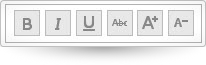
<!DOCTYPE HTML><html><head> <title>Toolbar Demo</title> <!-- Infragistics Combined CSS --> <link href="css/themes/infragistics/infragistics.theme.css" rel="stylesheet" type="text/css" /> <link href="css/structure/infragistics.css" rel="stylesheet" type="text/css" /> <!-- jQuery Core --> <script src="js/jquery.js" type="text/javascript"></script> <!-- jQuery UI --> <script src="js/jquery-ui.js" type="text/javascript"></script> <!-- Infragistics Combined Scripts --> <script src="js/infragistics.core.js" type="text/javascript"></script> <script src="js/infragistics.lob.js" type="text/javascript"></script> <script type="text/javascript"> $(function () { $('#toolbar').igToolbar({ "name": "textToolbar", "displayName": "text manipulation toolbar", "isExpanded": true, "collapseButtonIcon": "ui-igbutton-collapse", "expandButtonIcon": "ui-igbutton-expand", "items": [{ "name": "Bold", "type": "button", "scope": null, "props": { "allowToggling": { "value": true }, "isBold": { "value": false, "action": "_isSelectedAction" }, "boldButtonTooltip": { "value": "Bold", "action": "_tooltipAction" }, "boldButtonIcon": { "value": "ui-igbutton-bold", "action": "_buttonIconAction" } } }, { "name": "Italic", "type": "button", "props": { "isItalic": { "value": false, "action": "_isSelectedAction" }, "italicButtonTooltip": { "value": "Italic", "action": "_tooltipAction" }, "italicButtonIcon": { "value": "ui-igbutton-italic", "action": "_buttonIconAction" } } }, { "name": "Underline", "type": "button", "props": { "isUnderline": { "value": false, "action": "_isSelectedAction" }, "underlineButtonTooltip": { "value": "Underline", "action": "_tooltipAction" }, "underlineButtonIcon": { "value": "ui-igbutton-underline", "action": "_buttonIconAction" } } }, { "name": "Strikethrough", "type": "button", "props": { "isStrikethrough": { "value": false, "action": "_isSelectedAction" }, "strikethroughButtonTooltip": { "value": "Strikethrough", "action": "_tooltipAction" }, "strikethroughButtonIcon": { "value": "ui-igbutton-strikethrough", "action": "_buttonIconAction" } } }, { "name": "increasefontsize", "type": "button", "handler": "_increaseFontSize", "props": { "allowToggling": { "value": false }, "isIncreaseFont": { "value": false, "action": "_isSelectedAction" }, "increaseFontButtonTooltip": { "value": "Increase Font Size", "action": "_tooltipAction" }, "increaseFontButtonIcon": { "value": "ui-igbutton-increasefontsize", "action": "_buttonIconAction" } } }, { "name": "decreasefontsize", "type": "button", "handler": "_decreaseFontSize", "props": { "allowToggling": { "value": false }, "isDecreaseFont": { "value": false, "action": "_isSelectedAction" }, "decreaseFontButtonTooltip": { "value": "Decrease Font Size", "action": "_tooltipAction" }, "decreaseFontButtonIcon": { "value": "ui-igbutton-decreasefontsize", "action": "_buttonIconAction" } } }] }); }); </script> <style> #toolbar_collapseButton { display: none; } </style></head><body> <div id="toolbar"></div></body></html> |
Dependencies
jquery-1.9.1.js
jquery.ui.core.js
jquery.ui.widget.js
infragistics.util.js
infragistics.ui.shared.js
infragistics.ui.popover.js
infragistics.ui.toolbarbutton.js
infragistics.ui.splitbutton.js
infragistics.ui.colorpicker.js
infragistics.ui.colorpickersplitbutton.js
infragistics.ui.combo.js