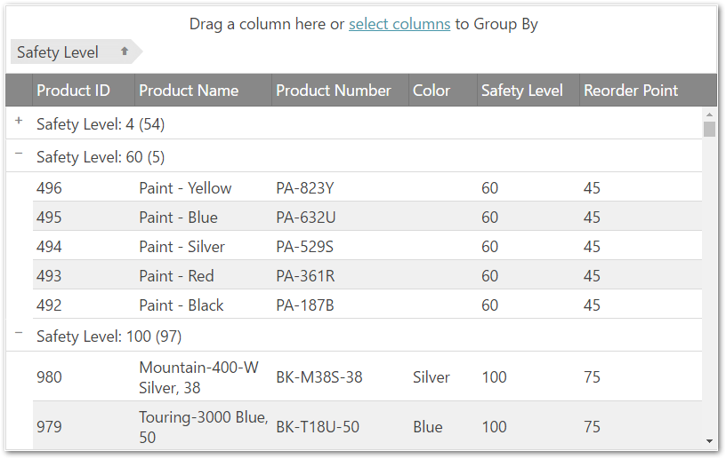
This topic introduces the grouping functionality of the igGrid™.
This topic contains the following sections:
The igGrid supports a column grouping functionality that enables the user to employ the data in one or more columns in a grid as a primary and, respectively, secondary criteria for organizing the records in the group in groups. The picture bellow demonstrate a grid in which the values of the SafetyStockLevel column – 500, 8000, 1,000, etc. – are used to group and arrange the data in the grid, i.e. the grid is grouped by its SafetyStockLevel column.

Grouping in the igGrid works the same as the analogous functionality in Microsoft® Office Outlook® – you drag a column that you want to group by and drop it into a special grouping area above the grid. This re-arranges the grid with as many groups as distinct value are there in the selected column. In addition, inside the groups, the records are sorted. If you drop additional columns, then, within the already existing groups, further groupings are applied.
You can define your own custom grouping method. For details about custom grouping, refer to the Grid Group By Overview topic.
Grouping is implemented and managed by the Group By widget.
Persisting grouped columns between igGrid re-bindings is made easy in version 14.1 and in fact replaces the previous default behavior.
Note GroupBy persistence is true by default. This is a breaking change.
When you enable igGridGroupBy you are already using it in a persist mode. This means that after explicitly calls of dataBind(), that persistence is applied for UI and data source view (the grouped columns are not cleared and the data source remains sorted)
GroupBy persistence is implemented for igHierarchicalGrid too.
The following sample demonstrates the persistance capabilities of the GroupBy feature.
If you would like to retain the previous behavior of group by being cleared after user re-binds the igGrid, you can do this by disabling the feature through the persist option as shown in the code snippet below:
In JavaScript:
features: [
  {
     name: “GroupBy”,
     persist: false
  }
]
The table below briefly explains the grouping main features and the Group By widget properties that manage them.
Note: In the following table, the properties and events specific to the Group By Dialog are not listed. They are available in the Group By Dialog topic.
| Feature | Description | jQuery Property | MVC Property |
|---|---|---|---|
| Grouping mode | There are several grouping modes supported by the Group By widget. | type | Type |
| Column Settings | This option allows configuring every column’s group by separately. | columnSettings | ColumnSettings |
| Group summaries in group row | Group summaries are provide some group-specific information about every group, like the the count of the rows in the group. Group summaries are configured individually for every group. | summarySettings | SummarySettings |
| GroupBy Summaries per data-island | Allows an additional summary row to be displayed below each group data island that displays summary information for the data columns in that island. | groupSummaries | SummarySettings |
| Grouped row text templates | Template for the text of the grouped row. (Follows the jQuery templating guidelines.) | groupedRowTextTemplate | GroupedRowTextTemplate |
| Client events |
The Group By widget has special events that can be handled during its lifecycle. They are events, which are fired when: the grouping action begins. (This event is cancelable.) the grouping action ends. This event is fired also when group/ungroup from Group By modal dialog. |
groupedColumnsChanging groupedColumnsChanged |
groupedColumnsChanging groupedColumnsChanged |
| Appearance | Plenty of features that allow you changing the look-and-feel of the group indicators and their text. |
groupByAreaVisibility
initialExpand emptyGroupByAreaContent expansionIndicatorVisibility groupByLabelWidth labelDragHelperOpacity indentation expandTooltip collapseTooltip removeButtonTooltip |
GroupByAreaVisibility
InitialExpand EmptyGroupByAreaContent ExpansionIndicatorVisibility GroupByLabelWidth LabelDragHelperOpacity Indentation ExpandTooltip CollapseTooltip RemoveButtonTooltip |
The following sample demonstrates how to use the compareFunc to customize the grouping:
Note: You can also customize grouping of the
timecolumn using thecompareFunc. See the example code for more details.
In order to group a column programmatically, you need to do this in the following way:
In JavaScript:
$('#grid1').igGridGroupBy('groupByColumn', 'ProductID');
The applied sorting expressions can be retrieved from the data source of the grid. In order to get them programmatically, you can use the following:
In JavaScript:
var expressions = $('#grid1').data('igGrid').dataSource.settings.sorting.expressions; // array of expressions
// expression structure
{compareFunc: <type="function" comparer function>, dir: <type="string" sort direction>, fieldName: <type="string" column key>, isGroupBy: <type="bool" is the expression created by the Group By widget>, layout: <type="string" the key of the layout if done in igHierarchicalGrid>}
Expressions created by the Group By widget have a property "isGroupBy" equals to "true" to distinguish them from the ones created by the Sorting widget.
To get the grouped data (data rows and group rows) programmatically you need to do this:
In JavaScript:
var data = $('#grid1').data('igGrid').dataSource.groupByData();
// group rows' structure
{collapsed: <type="bool" collapsed state>, fieldName: <type="string" column key>, gbExpr: <type="object" group by expression object>, id: <type="string" identificator of the group row>, len: <type="number" the number of data rows in the group>, level: <type="number" level of grouping>, recs: <type="array" set of the data records in the group>, val: <type="string" the value of the group>}
The group rows in the group by data are objects which contain the generated ID of the physical group row. The ID can be used to collapse and expand the row programmatically:
In JavaScript:
var data = $('#grid1').data('igGrid').dataSource.groupByData(),
    id = data[0].id;
// collapse
$('#grid1').igGridGroupBy("collapse", id);
// expand
$('#grid1').igGridGroupBy("expand", id);
The following sample provides additional information related to the API usage:
The following keyboard interactions are available.
When focus is on the grid:
When focus is on the element:
When focus is on the dialog:
The following topics provide additional information related to this topic.
The following samples provide additional information related to this topic.
View on GitHub