This topic demonstrates how to use the igGrid™ control’s Hiding Column Chooser.
The following table lists the topics required as a prerequisite to understanding this topic.
Touch Support for Ignite UI for jQuery Controls: This topic introduces the updates to Ignite UI for jQuery™ controls for touch-support interactions.
igGrid Feature Chooser: This topic explains the igGrid Feature Chooser menu and its sections.
igGrid Hiding Overview: Overview of the igGrid control’s Hiding feature.
This topic contains the following sections:
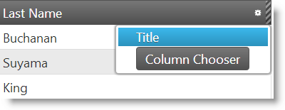
This topic demonstrates how to work with the igGrid Hiding dialog also known as Column Chooser. You can activate the Columns Chooser window in two different ways. The first way is to select Column Chooser list item from the igGrid Feature Chooser advanced section and second on is to press Column Chooser button from the hidden column context menu.


The following table summarizes the states of the Hiding Column Chooser Window. The window has two states as defined by the value of the option columnChooserHideOnClick (default value is false). If set to true, then the columns will hide immediately on click of the column name in the Column Chooser.
Additional details are available after the summary table.
| State | columnChooserHideOnClick |
Description |
|---|---|---|
| Hide multiple columns at once | false |
Multiple columns are selected from the column chooser window and columns are hidden when the changes are applied in the window. |
| Hide column on click | true |
Columns are immediately hidden by selecting a column from the column chooser window. |
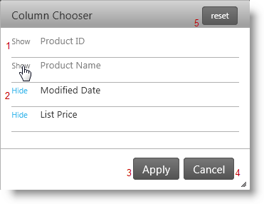
By default the property columnChooserHideOnClick is set to false. This means that you must select which columns to show or hide and then apply the changes to the grid.

Use the following buttons:
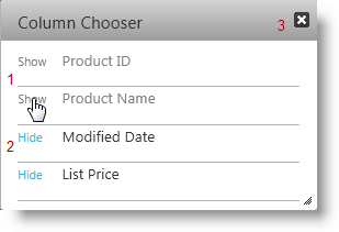
When the property columnChooserHideOnClick is set to true then when you click on a Show or Hide button the selected action will take effect immediately to a column.
To close the window use the button at the top right or press the ESC key.

Use the following buttons:
This section explains igGrid control’s Hiding properties that affect Column Chooser.
The following table shows the igGrid control’s Hiding properties that are responsible for the configuration of the Column Chooser.
| Property | Description |
|---|---|
| columnChooserHideOnClick | Specifies whether the grid will show or hide a column when the column name is clicked in the column chooser. |
| columnChooserWidth | The default column chooser width in pixels. |
| columnChooserHeight | The default column chooser height in pixels |
| columnChooserAnimationDuration | Specifies time in milliseconds for the animation duration to show or hide Column Chooser |
| columnChooserCaptionText | The caption of the column chooser dialog. |
| columnChooserDisplayText | The text used in the drop down tools menu (Feature Chooser) to launch the column chooser dialog. |
| hiddenColumnIndicatorTooltipText | The text displayed in the tooltip of the hidden column indicator. |
| columnHideText | The text used in the drop down tools menu (Feature Chooser) to hide a column. |
| columnChooserShowText | The text used in the column chooser to show a column. |
| columnChooserHideText | The text used in the column chooser to hide a column. |
| columnChooserResetButtonLabel | Text label for reset button. |
| columnChooserButtonApplyText | Specifies text of button which applies changes in modal dialog. |
| columnChooserButtonCancelText | Specifies text of button which cancels changes in modal dialog. |
This section explains igGrid control’s Hiding methods that affect Column Chooser.
The following table shows the igGrid control’s Hiding methods exposed by the Column Chooser API.
| Method | Description |
|---|---|
| showColumnChooser | Shows the Column Chooser dialog. If it is visible the method does nothing. |
| hideColumnChooser | Hides the Column Chooser dialog. If it is not visible the method does nothing. |
| resetHidingColumnChooser | Reset hidden/shown column to initial state of dialog (when it is opened) |
| removeColumnChooserResetButton | Remove Reset button in column chooser modal dialog |
This section explains igGrid control’s Hiding events raised by the Modal Windows.
The following table shows the igGrid Hiding events that are fired during user interaction with the Column Chooser.
| Event | Description |
|---|---|
| columnChooserOpening | Event fired before the column chooser is opened. |
| columnChooserOpened | Event fired after the column chooser opens. |
| columnChooserMoving | Event fired every time the column chooser changes its position. |
| columnChooserClosing | Event fired before the column chooser is closed. |
| columnChooserClosed | Event fired after the column chooser is closed. |
| columnChooserContentsRendering | Event fired before the contents of the column chooser are rendered. |
| columnChooserContentsRendered | Event fired after the contents of the column chooser are rendered. |
| columnChooserButtonApplyClick | Event fired when Reset button in column chooser is clicked |
| columnChooserButtonResetClick | Event fired when Reset button in column chooser is clicked |
The following topics provide additional information related to this topic.
Touch Support for Ignite UI for jQuery Controls: This topic introduces the updates to Ignite UI for jQuery™ controls for touch-support interactions.
igGrid Feature Chooser: This topic explains the igGrid Feature Chooser menu and its sections.
igGrid Hiding Overview: Overview of the igGrid control’s Hiding feature.
The following sample provides additional information related to this topic.
View on GitHub